Wednesday, 24 October 2012

Principles of Economics: Revenue (Microeconomics)

* Sorry about the delay with this post, I've had a busy week and have just got round to writing this up. But I'll have another one up tomorrow as well to make up for it. *

Right, today's post will be relating to revenue and more specifically a firms revenue. We'll start with a few of the basic bits of terminology that I'll be using throughout this post. Firstly, total revenue. This is fairly self-explanatory but I'll give a definition anyway. Total revenue is a firms total earnings in a period of time from the sale of a particular amount of goods, the formula is better known as price x quantity. Average revenue next and this is the amount a firm earns for each unit sold, the formula for this is (total revenue) / (quantity) which you may have noticed just equals price. Marginal revenue is the final term, this refers to the extra revenue gained from selling one more unit of a good. The formula for marginal revenue is (change in total revenue) / (change in quantity).

We'll first look at the revenue curves for a small firm. We'll be assuming this firm is in a perfectly competitive market (Will do a blog post on this later today/tomorrow). Basically, this means that the firms are generally too small to have any effect on the price of the good they are selling. If they raise their price no-one will buy from them, if they lower their price they will find an overwhelming demand and probably be charging less than the cost to produce the good. That being said, the market forces determine the price the firm has to charge.


As you can see here, the demand and supply have met in the market and this has created a price for the good. The firm, shown on the left has a demand curve of this price because consumers will only buy from the firm at this price. No matter the quantity, the price will remain the same. Another note on this, D = AR = MR because the price is constant. The average revenue and marginal revenue will always be the same because we are working with a constant price.  We can model the total revenue of a firm as well. This is simple, first we create a table with the quantity supplied, price and total revenue. We then plot this table. Simple.


Simple as that for a total revenue curve for a small firm. However, when it comes to larger firms and the price of the good does vary with output we are struck with a different scenario. The average revenue curve is still equal to the price and will be the demand curve, but this time it will be downward sloping as with the normal characteristic of demand. The marginal revenue curve will also be downward sloping, but at a faster rate than the average revenue curve and will more than likely reach negative values. This is due to the diminishing marginal rate of production, the marginal revenue falls with each additional good you produce up to a point where producing another good will generate no additional revenue and may even decrease revenue. Before the quantity where marginal revenue equals zero, the average revenue is elastic because an increase in quantity will lead to a rise in revenue. After this point, it's inelastic because a rise in quantity leads to a fall in total revenue. 

And all that's left to add to this is the shape of the total revenue curve when the price varies with output. I should note, this happens in larger firms when they can effect the market price. The total revenue curve would be somewhat hill shaped. It would slope up, reach a peak at some unknown point and then slop down again afterwards. You may be thinking "Ok, great... Why?"! Well, this will come in useful in the next posts when we look at profit maximisation of a firm. 

Thank you for reading again, keep watching for the next few posts which will relate and link to this one. Have a good day!

Sam. 


Thursday, 18 October 2012

Principles of Economics: The Budget Line (Microeconomics)

This post will make the next logical step on from indifference analysis by introducing the concept of the budget line. The budget line shows us the combinations of two goods that can be purchased with a given income to spend on them at their set prices. You guessed it, a graph is coming! The easiest way to show a budget line is for me to construct a diagram. Here is it, this is a budget line for good X and good Y assuming good X costs £2 and good Y costs £1 and the budget available is £30.

The area above the line isn't feasible to achieve given the prices of the two goods and the budget available. If incomes were to increase, say to £40 or the prices of both goods were to fall by the same percentage we would see the budget line shift as is shown in this next diagram. The rule is, changes in income or equal changes in price will cause the budget line to shift parallel to the original curve. Here's the new curve with an increased budget of £40:

The slope of the line here represents the relative price of the two goods. So in the example above it was 30/15 = 2 for the first line and 40/20 = 2 for the second line. The rule of thumb for that is Price of Y / Price of X. Prices can also change independently of each other, as we well know. If one price changes and the other doesn't, this causes a pivot on the diagram. If good X changed from £2 to £1 we'd see a pivot around the initial point on the Y axis. This next diagram will show that:

The pivot here is quite clear, as the price of good X decreases it means more can be consumed while the consumption of good Y remains constant. 

Next, we'll move on to a more complex concept - the optimum consumption point! This is where we combine the budget line from above and the indifference curves from the blog post I did a few days back. By definition, the optimum consumption point will be where the budget line touches the highest indifference curve on an indifference map. As with most concepts, this is also much easier to understand when represented on a diagram:

Here you can see that the budget line touches, or is tangential, to the indifference curve L2, which is the highest one it touches. Therefore we can say that the optimum consumption point for these two goods would be X1 of good X and Y1 of good Y. We know the slope of the budget line is Px / Py and we know from the previous blog post that the indifference curve slope at any point is MuX / MuY. Therefore, the optimum consumption point is the point where (Px / Py) = (MuX / MuY)!

A change in income will cause a change to the diagram. The budget line will either shift out or in depending on whether incomes rose or incomes fell. This new budget line would cross and indifference curve at a different point, if you joined the new optimum consumption point and the old one you'd have created a new line that we call the income-consumption curve in economics. As with a change in price of one of the goods, the budget line will pivot and a new optimum consumption point will be formed. Connect the original point and the new point and this line you've created is called the price-consumption curve. 

Now for the exciting bit! Actually deriving a consumers demand curve for a good!  


Ok, there is a demand curve derived for good X using the indifference curves and budget lines. Look at it, take it in, see if you can see what's going on. It's difficult, I know. Here's my explanation attempt: On the top diagram we have used good X along the bottom and money for all other purposes on the Y axis. We have a set budget and at varying prices of X this budget line is pivoting. Each of these new pivoted budget lines crosses indifference curves at different points to form a price-consumption curve. The points of intersection of each budget line translate down to as the quantities demanded of good X. Now, to work out the prices for the second diagram. Lets look at the first budget line for this. It crosses L1, we can see that. At that point it has translated down to the bottom diagram as Q1. The price here is the same as the slope of the curve.. so assuming we have a budget of £30 I'd say the budget line hits the X axis at roughly 17. So, 30/17 = 1.76, which is the roughly where the point is on the second diagram. If we did the same for the other two budget lines we'd receive prices of 1.2 and 0.94. These are those two other price points you can see on the diagram. Then as with any other demand curve, join the dots to actually complete the demand curve for good X. PHEW!

That's it, finally. It may be difficult to grasp in parts, if it is then comment with where you are finding it difficult and I'll give you a helping hand. I'll get back to you within a few hours normally, so keep checking back! Thanks for reading again guys, have a good day.

Sam. 


Monday, 15 October 2012

'Dilemmas of an Economic Theorist'

Just a quick one here, thought I'd pass on a link to a great article I've just read by Ariel Rubinstein. He's written a paper named 'Dilemmas of an Economic Theorist' in which he questions the place of economists in the real world. Whether our models and our input are actually having a positive impact on the real world. It's a very engaging and entertaining read, much different from your standard academic paper. The conclusion is that the models we economists create are much like fables or fairy-tales as we make our models free of extra data and annoying diversions, just like in a fable. Have a read, here's the link:


Let us know what you think of it. I'll be back later in the week with another post, so have a good few days! Cheers guys.

Sam.

Friday, 12 October 2012

Preferential Trading Arrangements

Preferential trading arrangements refer to such things as trade blocs. Trade restrictions are held with the rest of the world but lower restrictions or none with member states. There are three types of preferential trading arrangement:

  • Free Trade Area - This is when member states remove tariffs and quotas with one another. However, restrictions on trade with non-member states are kept individual to each nation.
  • Customs Union - This is the same as above, but in addition there are common external restrictions on trade with non-member states. 
  • Common Markets - This takes it one step further and the members operate as a single market. This means as well as the features of the above arrangements there is also a common taxation system, common laws regarding production, employment and trade, free movement of labour and capital and no special treatment by governments to their own domestic industries. Additionally to this, we sometimes see fixed exchange rates between members and common macroeconomic policies. 

Next we move on to trade creation and trade diversion, which come as a result of preferential trading arrangements. First, trade creation. This is when consumption shifts from a high-cost producer to a low-cost producer as a result of of joining the customs union. Normally this is due to obtaining the goods cheaper from other members of the union. As with most things, this can be modeled on a diagram! 

Trade Creation Diagram

This is it, the trade creation diagram. Let's explain it a bit. SDom and DDom are the domestic supply and demand of a good. Before the EU, the country had to pay at the 'PEU + tariff' price so domestic production was at Q2 and domestic demand was at Q1. The imports here were the difference between Q1 and Q2. With the joining of the EU, the price was now the PEU price, lower than before. This meant domestic supply had fallen to Q4 and domestic demand had risen to Q3. So the new imports level is the difference between Q3 and Q4, which is higher than before. Thus, trade has been created. 

Trade diversion works in very much the opposite way. This is when consumption shifts from a lower cost producer outside the customs union to a higher cost producer inside it. There is a net loss in world efficiency now the higher cost producer is being used. 

Trade Diversion Diagram


This is the trade diversion diagram. The country was initially paying price P1 for the good, meaning they consumed at Q1 and produced at Q2. Price falls to P2 because of the joining of the EU. We can see here, that consumer surplus has improved. The original consumer surplus at price P1 has now increased to include the areas 1, 2, 3 and 4 on the diagram. We also notice a loss of producer surplus by area 1 which will be the fall in profits. No tariffs are paid out anymore, so the areas 3 and 5 are lost to the government in terms of revenue. This leaves an overall net gain of areas 1 + 2 + 3 + 4 - 1 - 3 - 5 = 2 + 4 - 5. Here we can decide whether the trade diversion has been beneficial or detrimental. If the size of area 5 which we have lost is greater than the size of areas 2 plus 4 which we've gained then there is a net loss, otherwise we've achieved a net gain. 

If there are high external tariffs or a small cost difference between goods produced inside and outside of the union then a customs union is likely to lead to trade diversion.

In the long term, a customs union could have advantages and disadvantages, I'll name a few of both:
  • Advantages:
    • Increased market size - allows firms to potentially exploit economies of scale to lower costs.
    • Better terms of trade with world markets because of the power of the customs union.
    • Increased competition which will stimulate efficiency and bring costs down.
  • Disadvantages:
    • Resources may flow to the geographical centre for the lower transport costs leaving depressed regions on the edge of the union.
    • Mergers will be encouraged which will boost monopoly powers.
    • Diseconomies of scale.
    • The administration costs of maintaining the union.

The basics of preferential trading arrangements in one blog post, tadaaa! Thank you for reading, keep sharing and following the blog! Thanks guys, have a good day.

Sam.

Sunday, 7 October 2012

Principles of Economics: Indifference Analysis (Microeconomics)

Indifference analysis is basically a solution to the issues that arise from using the marginal utility theory to derive demand. Utility cannot be measured absolutely, which is one of the problems with the marginal utility theory. In indifference analysis we rank combinations of goods in order of preference. This can get quite complex, but stick with it!

We start by looking at a simple indifference curve. An indifference curves, by definition, shows us all the combinations of two goods that give the same amount of satisfaction. All the combinations that will leave the consumer 'indifferent'. We first have to construct an indifference set like this:


At all combinations of these two goods above, the consumer in question is equally as satisfied. We then go on to map this data out onto a diagram.


Here we have an indifference curve for the data above. The curve will slope downwards and get flatter and flatter the further along it you go. We can work out the marginal rate of substitution for the two goods from here as well using the formula (Change in Y) / (Change in X). This will give us the rate at which we are prepared to exchange good Y for good X and still remain indifferent. The more we move down the slope the more MRS diminishes. There's two ways of looking at it, either way we say MRS decreases. If we follow the curve up and to the left, the value of MRS diminishes because it will always give a negative value. If we follow the curve to the right then the absolute value (ignoring the negative) will decrease. So, the principle is that as we move along an indifference curve MRS falls. 

We can go further on from this and generate an indifference map. This is different combinations of the two goods that give different amounts of satisfaction. It's modeled like this: 


You may see this referred to as a 'mountain' in some cases. But basically, the further up this 'mountain' you go the more satisfaction. Each of these indifference curves resembles a different combination of goods which give the same amount of satisfaction. L1 is the least satisfied combination whereas L4 is the most satisfied. Would the lines ever cross i hear you say? Well, no is the short answer to that. We can prove this via contradiction. Picture two indifference lines that cross in your head. Point A is the point they cross, point B is a point on one curve and point C is a point on the other curve. We can say that A is indifferent to B because they are on the same curve and we can also say that A is indifferent to C. By this, we should be able to say that B is indifferent to C, but this isn't the case because one of these points will offer a better combination of goods than the other and therefore give more satisfaction, making the two points not indifferent. By this logic the indifference curves cannot cross. 

Mhmm, that's an introduction to indifference curve. The next logical step from this will be too look at the budget line which I will do in the next few blog posts. So expect that at some point next week. Thanks for reading, please follow and share the blog if you found it useful! Any comments are much appreciated! Have a good night/day!

Sam. 


Thursday, 4 October 2012

Principles of Economics: Marginal Utility Theory (Microeconomics)

In this blog I'll be looking at one of the theories as to how exactly we derive the demand. This is called the marginal utility theory. All the way through this we make the assumption that consumers act and behave in a rational manner - they choose their consumption rationally and consistently. A rational consumer therefore would be one that aims to get the best value for their money. Bear that in mind and remember it as we run through this principle.

Lets start at the very basics by defining a few things. A phrase that will crop up a lot now is 'utility'. Basically, this is the term economists give to the satisfaction a consumer receives when consuming a good. Obviously, it's a totally theoretical thing as it's near on impossible to actually measure how happy or satisfied a consumer gets when consuming a good. But, for the benefit of the theory and the examples it is used. Total utility will then refer to the total satisfaction or happiness gained from all the units of the good that have been consumed. Another term here is marginal utility. This is the additional satisfaction from consuming one extra unit of a good. If i gained 10 utility from eating 6 bananas and 12 utility from eating 7 bananas then the marginal utility here would be 2 (12-10). Utility, like i said, is a very subjective thing, we have to make an assumption that it can be measured. The measurement of utility is a util. One util is one unit of satisfaction.

Marginal utility follows a diminishing pattern, the more of a good the consumer consumes the lower the marginal utility gets. This is because for every extra unit of a good consumed you won't be getting as happy until you finally reach a point at which total utility is at maximum and will only fall if any more of the good is consumed. Lets look at an example, here we have a table for the consumption of a good and the utility it gives the consumer:


This data can then be plotted onto a graph, displaying the total and marginal utility curves like this:


Before I continue, I apologise for the graphs.. I try my hardest, I'm just not a dab hand at using Paint! Anyway, here we have the total utility and the marginal utility for the table above drawn out. As you can see, marginal utility slopes downwards and total utility always starts at the origin. Total utility will peak when marginal utility is at 0. We can take any point on the total utility curve and it'll equate to the equivalent point on the marginal utility curve. For example, between 2 and 3 consumption the change in the total utility is 2 and the change in quantity consumed is 1. 2/1 = 1 of course, which if we look at the marginal curve is where MU is at 3 consumption. The general rule for that is (change in total utility) / (change in consumption) = MU. 

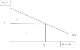
We can also work out what the optimum level of consumption for one good is with utility, to do this we need to measure utility with money. So utility now becomes the value people place on their consumption and marginal utility is the amount a person would pay to achieve one more unit of a good. We open up a new principle here, the marginal consumer surplus or MCS for short. This is the difference between what someone is willing to pay for one more good and what they actually pay. An equation for this would be: MCS = Marginal Utility (MU) - Price (P). Total consumer surplus (TCS) can come into play now too, this being the sum of all marginal consumer surpluses that are gained from all the good consumed. This is effectively the difference between the total utility from all units in monetary terms and the actual expenditure on them. In equation form: TCS = Total utility (TU) - Total expenditure (TE). As with most things economical, we can graph out this concept. 


The rational consumer is aiming to maximise their consumer surplus. So, on the diagram, area 1 represents the consumers total expenditure. It'd value out at P x Q. The total utility of the consumer is area 1 + area 2. As we stated above, the total consumer surplus is TU - TE so therefore area 2 on its own is the total consumer surplus. The quantity Q here maximises consumer surplus, so that is the point to consume at. Any lower quantity and consumer surplus wouldn't be maximised, any higher and consumer surplus wouldn't increase but spending would. 

The market demand curve for a good can be derived from the individuals demand curves. The individuals demand curve is the MU curve for the good. So the market demand curve for a good is the sum of all individual MU curves. It's shape depends entirely on the rate that MU falls in general for the individuals. A shift could occur if, for example, the price of a substitute good rises the MU will rise because people will desire the original good more instead of the higher priced substitute. 

This theory for working out the optimal consumption of one good does have it's limitations:
  • A change in consumption will affect the MU of both substitute and complimentary goods and also effect income left over to spend.
  • Money itself doesn't have a constant MU.
  • Income rising means extra money meaning each pound will bring less satisfaction.
  • We cannot literally use money in an absolute sense to measure utility. ]

It's more appropriate to measure the optimal consumption of goods in combination, two goods in the example. This involves finding the equi-marginal price. This is where the consumer gets the highest utility from a level of income, which is where the ratio of the MUs of the two goods is equal to the ratio of the price. In equation form this would be (MU of good A) / (MU of good B) = (Price of good A) / (Price of good B). 

...And exhale. That's me done, the basics of marginal utility and how it can be used to derive demand. A lot in one go I know, but you'll get the hang of it. My next post on the principles of economics will be focused on indifference curves. Thanks for reading guys, have a good night!

Sam. 


Tuesday, 2 October 2012

Principles of Economics: Supply (Microeconomics)

*Disclaimer: I'm fully aware of the fact that I've already written a post on supply. However, I've decided to cover it again now I know more on the subject and can give a better coverage.* 

Okay, I'll dive straight into this one with the main principle of supply: 'When the price of a good rises, the quantity supplied will also rise'. Now, it's all well and good just stating that, however we need to know the reasons why this happens. Let's look at three of them:

  • Beyond a certain level of production for the producer costs are likely to rise at a quicker rate than previously. This could be due to having to pay overtime to staff members or increased maintenance costs for machinery. Either way, the quantity supplied by producers will only rise if the price rises so that it becomes efficient for them to raise their costs.
  • A more basic reason now: The higher the price of the good, the more profitable it is for the firm. In general terms this theory holds true. Most firms have an aim of profit maximisation, so therefore they'll increase supply when the price rises to maximise profits.  Both of these two points are short term reasons as to why supply rises when price increases.
  • A long term reason is because when price rises in an industry new firms are encouraged to join the market with the hope of profit. This increase in firms will increase the supply to the market. 


Here we have a very basic graphical presentation of the supply curve. A supply curve shows us the supply schedule. Supply schedule refers to the amount producers are able to and willing to produce at different prices at a set point in time, it is normally shown in a table and can then be presented in a graph like the one above. The supply curve will generally slope upwards from left to right, to show that the higher the price the higher the supply will be. Obviously, price elasticity of supply plays a part in the steepness of the slope but I'll get on to that point in a few blog post times, I'm keeping it very basic here. 

As with demand, there are many factors apart from just price that affect the supply of a good to the market. These are the main ones:
  • Production cost - Higher costs mean less profits means less supply and vice versa. This can be because of a change in the input prices (wages, raw materials), government policy (subsidies, taxation), organisation changes or technology changes.
  • Nature - This can include the weather, disease, natural disaster. Basically things that are out of human control.
  • Aims of the producer - The supply of a firm aiming to maximise profit will be different to a firm aiming for sales maximisation. Therefore different producer aims will cause varying levels of supply. 
  • Expectations - If prices are expected to rise, producers will hold onto stock in anticipation of this rise meaning supply will fall. This works the opposite way for if prices are expected to fall.
  • Number of suppliers - Simply put, more producers means more supply, less producers means less supply. 
  • Profitability of alternatives - If a substitute in supply is more profitable, supply for the good in question may fall. Alternatively, if a substitute in supply is less profitable, the good in questions supply may rise as the producer re-diverts resources. 
  • Profitability of goods in joint supply - Goods that are produced together mean if the profitability of the joint good rises then the supply of the good in question may also rise. Works the opposite way too.

As with demand, there can either be a movement along the supply curve or a shift in the supply curve. 


A change in price will mean a movement along the supply curve. So, the supply curve will stay at the initial place of 'Supply 1' on the diagram and the point supplied will just move up or down that curve. If any of the other determinants of supply stated above change then we can expect a shift in supply. A shift to the right, 'Supply 1' to 'Supply 2' on the diagram, shows an increase in supply. A shift to the left, 'Supply 1' to 'Supply 3' on the diagram, shows a decrease in supply. A movement along the curve is known as a change in the quantity supplied whereas a shift in the supply curve is known as a change in supply.

There we have it, a recap on the basics of supply. Next to come in terms of principles of economics will be marginal utility theory, so stay tuned for that! Thanks for reading and have a good day.

Sam.