Showing posts with label Utility. Show all posts

Monday, 8 April 2013

Indifference Analysis


Back to a more educational point of view now following the last post I wrote. Today will be a look back, potentially in more detail, at the concept of indifference analysis. I'll try and start at the very basics and work my way through the subject - if you feel I've left anything out do not hesitate to let me know in a comment and I'll try and go over it for you. This post is long, I won't hide that fact. Make full use of the search bar to the left of this to make sure this contains what you're looking for. Even better still, use Ctrl + F and search for keywords. That could save you some time!

Indifference analysis is a basic concept in economics which looks at consumers preferences for two goods. It is an "exactly what it says on the tin" topic - we are looking at combinations of these two goods that the consumer would feel indifferent about. The definition of 'Indifferent' from dictionary.com, by the way, is "having no bias, prejudice, or preference; impartial; disinterested." So, rephrasing it into Layman's terms: we are looking at combinations of these two goods that the consumer would feel equally as happy, content, etc with. This will become evident later on in the analysis.

The very first step in the analysis will be to construct an indifference curve. This is done below.


Here we have an indifference curve. This is modelling different combinations of Good A and Good B that the consumer would feel indifferent about. Anywhere along this curve the consumer will be feeling the same level of satisfaction. Indifference curve slope downwards - that is a general rule. Why? I hear you ask. Well, it's due to the diminishing marginal rate of substitution. This piece of jargon essentially means the rate at which we would swap Good A(Y) for Good B(X) while remaining equally as satisfied. It looks as follows:

                                               
If we used some figures as an example, let's say that the consumer is indifferent between 25 of Good A and 5 of Good B and is also indifferent between 20 of Good A and 6 of Good B. Right. So, the top of the equation would be (20 - 25) and the bottom of the equation would be (6 - 5). That leaves us with -5 as the answer. So, between the points (25,5) and (20,6) on a diagram the slope would be -5. We can focus in on the negative sign here, this shows why the curve is always downwards sloping. We have to give up some of Good A to get more of Good B. Keeping up? Good.

An indifference curve alone tells us very little, an indifference map on the other hand tells us a lot more. An indifference map is a series of indifference curves showing which combinations of two goods give different levels of satisfaction.


If you think of the map as a mountain, starting from the bottom left corner and working diagonally to the right and up - the higher up the mountain we go the more satisfied the consumer. At any point on I4 the consumer is more satisfied than at any point on I2 for example. The question that creeps up a lot regarding indifference curves is "Could they ever cross?" In short, the answer is no. This can be proved via contradiction.


Consider the three points here: a, b and c. From the analysis we've just done we can say that a is indifferent to b. We can also say that a is indifferent to c. So, b 'should' be indifferent to c. But b has more of Good A for the same amount of Good B than c does, and therefore point b would be preferred. b and c aren't indifferent, and therefore indifference curves cannot cross. Bosh!

Now, for a consumer to make a decision about what to consume we need more information than just the indifference curves. We need information on prices and incomes. This is where the budget line enters. I fear I'm stating the obvious here, but I'll have to continue: the budget line is how much of the two goods the consumer can afford. So, it'll have the following formula, which reads 'Price of Good A times the quantity of Good A plus the price of Good B times the quantity of Good B equals the consumers income:


If Good A was £2,  Good B was £1 and the consumer's income was £30 then we'd have an equation to work out: 2A + B = 30. Now we have our equation we can plot the budget line on a graph.


It is literally as simple as that for the budget line. All we need is the price of the two goods and the consumer's income and we can work out the quantities of each good they can purchase. While on the topic of the budget line I think I'll mention what happens to the line when prices and incomes change. If just one price changes then the budget line will swing in or out, pivoting around a point. For example, if the price of Good B fell, then we'd see the line swing out to the right, pivoting around the point on the Y axis. It would swing out because a fall in price of Good B means we can afford more of them. A rise in price causes a swing in. A change in the total budget or consumer's income means a shift in the whole budget line parallel to the current one. A rise in the budget shifts the curve out to the right, a fall in the budget shifts it in to the left. If both incomes and prices rise by the same percentage, or fall by the same percentage for that matter, we see no change in the budget line.

Moving swiftly on, we're ready to combine the indifference map and the budget line. This can give us the consumer's optimal consumption point. Utility or satisfaction for the consumer is maximised at the point of tangency between the budget constraint and the indifference map, as is highlighted in the graph below.


The slope of the indifference curve is the marginal rate of substitution and the slope of the budget constraint is (minus) the relative price of Good A and Good B. Therefore, where these meet, the consumer chooses optimally when MRS = Price of Good B / Price of Good A.

Another piece of jargon you may need to learn is the 'Price-Consumption curve'. This is a curve derived from the changing price of one of the goods. From this curve we can create a demand curve for that good. Clever stuff.


Now, to derive the demand curve from it. We make one alteration to the diagram above, we make the Y axis 'Expenditure on all other goods' instead of just Good A. Then, we follow the points of tangent down and onto a new diagram. On the Y axis of the below diagram we list the prices, which come from dividing the Budget by the quantity of Good B when expenditure on all other goods is 0. Match these prices up to the lines we've just drawn down and Bob's your uncle - a demand line. In words it sounds confusing, take a look at the diagram below and then re-read this until sense is made.


I hope that makes sense - reread and study the diagram.

Another 'special' curve we need to be aware of is the Income-Consumption curve. This tracks the effect a change in income has on our optimum choices of the two goods. The slope of this curve tells us about the desirability of Good A and Good B as incomes rise. In general, the curve will look something like this:


There is a special case where the shape of this curve bends the other way. This is when one of the goods is an inferior good - I trust we all know what that means. A higher budget will mean less is demanded and therefore the income consumption curve will bend back on itself.

Bravo to those of you that have made it this far and hello to those that skipped straight to this section. Neither of you will be judged... honest. Finally, we are going to look at the Engel Curve. An Engel Curve shows how the demand for a good changes as income changes. We use the Income-Consumption curve and track it down onto a new diagram below.
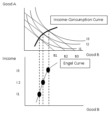

If incomes increase and this leads to a demand increase for the good then we are looking at a normal good. If demand decreases it is an inferior good. The final, more peculiar outcome, is in the case of a giffen good. Giffen good prices rise when demand rises, odd - but they do exist.

By gosh, I think we might be finished. I said 'potentially' more in depth at the beginning - I think that word can be scrapped. If you're still unsure of anything Indifference Analysis related then drop me a comment and I'll be happy to try and help you out if I can. Thank you for reading, have a good day!
Sam.

Sunday, 7 October 2012

Principles of Economics: Indifference Analysis (Microeconomics)

Indifference analysis is basically a solution to the issues that arise from using the marginal utility theory to derive demand. Utility cannot be measured absolutely, which is one of the problems with the marginal utility theory. In indifference analysis we rank combinations of goods in order of preference. This can get quite complex, but stick with it!

We start by looking at a simple indifference curve. An indifference curves, by definition, shows us all the combinations of two goods that give the same amount of satisfaction. All the combinations that will leave the consumer 'indifferent'. We first have to construct an indifference set like this:


At all combinations of these two goods above, the consumer in question is equally as satisfied. We then go on to map this data out onto a diagram.


Here we have an indifference curve for the data above. The curve will slope downwards and get flatter and flatter the further along it you go. We can work out the marginal rate of substitution for the two goods from here as well using the formula (Change in Y) / (Change in X). This will give us the rate at which we are prepared to exchange good Y for good X and still remain indifferent. The more we move down the slope the more MRS diminishes. There's two ways of looking at it, either way we say MRS decreases. If we follow the curve up and to the left, the value of MRS diminishes because it will always give a negative value. If we follow the curve to the right then the absolute value (ignoring the negative) will decrease. So, the principle is that as we move along an indifference curve MRS falls. 

We can go further on from this and generate an indifference map. This is different combinations of the two goods that give different amounts of satisfaction. It's modeled like this: 


You may see this referred to as a 'mountain' in some cases. But basically, the further up this 'mountain' you go the more satisfaction. Each of these indifference curves resembles a different combination of goods which give the same amount of satisfaction. L1 is the least satisfied combination whereas L4 is the most satisfied. Would the lines ever cross i hear you say? Well, no is the short answer to that. We can prove this via contradiction. Picture two indifference lines that cross in your head. Point A is the point they cross, point B is a point on one curve and point C is a point on the other curve. We can say that A is indifferent to B because they are on the same curve and we can also say that A is indifferent to C. By this, we should be able to say that B is indifferent to C, but this isn't the case because one of these points will offer a better combination of goods than the other and therefore give more satisfaction, making the two points not indifferent. By this logic the indifference curves cannot cross. 

Mhmm, that's an introduction to indifference curve. The next logical step from this will be too look at the budget line which I will do in the next few blog posts. So expect that at some point next week. Thanks for reading, please follow and share the blog if you found it useful! Any comments are much appreciated! Have a good night/day!

Sam. 


Thursday, 4 October 2012

Principles of Economics: Marginal Utility Theory (Microeconomics)

In this blog I'll be looking at one of the theories as to how exactly we derive the demand. This is called the marginal utility theory. All the way through this we make the assumption that consumers act and behave in a rational manner - they choose their consumption rationally and consistently. A rational consumer therefore would be one that aims to get the best value for their money. Bear that in mind and remember it as we run through this principle.

Lets start at the very basics by defining a few things. A phrase that will crop up a lot now is 'utility'. Basically, this is the term economists give to the satisfaction a consumer receives when consuming a good. Obviously, it's a totally theoretical thing as it's near on impossible to actually measure how happy or satisfied a consumer gets when consuming a good. But, for the benefit of the theory and the examples it is used. Total utility will then refer to the total satisfaction or happiness gained from all the units of the good that have been consumed. Another term here is marginal utility. This is the additional satisfaction from consuming one extra unit of a good. If i gained 10 utility from eating 6 bananas and 12 utility from eating 7 bananas then the marginal utility here would be 2 (12-10). Utility, like i said, is a very subjective thing, we have to make an assumption that it can be measured. The measurement of utility is a util. One util is one unit of satisfaction.

Marginal utility follows a diminishing pattern, the more of a good the consumer consumes the lower the marginal utility gets. This is because for every extra unit of a good consumed you won't be getting as happy until you finally reach a point at which total utility is at maximum and will only fall if any more of the good is consumed. Lets look at an example, here we have a table for the consumption of a good and the utility it gives the consumer:


This data can then be plotted onto a graph, displaying the total and marginal utility curves like this:


Before I continue, I apologise for the graphs.. I try my hardest, I'm just not a dab hand at using Paint! Anyway, here we have the total utility and the marginal utility for the table above drawn out. As you can see, marginal utility slopes downwards and total utility always starts at the origin. Total utility will peak when marginal utility is at 0. We can take any point on the total utility curve and it'll equate to the equivalent point on the marginal utility curve. For example, between 2 and 3 consumption the change in the total utility is 2 and the change in quantity consumed is 1. 2/1 = 1 of course, which if we look at the marginal curve is where MU is at 3 consumption. The general rule for that is (change in total utility) / (change in consumption) = MU. 

We can also work out what the optimum level of consumption for one good is with utility, to do this we need to measure utility with money. So utility now becomes the value people place on their consumption and marginal utility is the amount a person would pay to achieve one more unit of a good. We open up a new principle here, the marginal consumer surplus or MCS for short. This is the difference between what someone is willing to pay for one more good and what they actually pay. An equation for this would be: MCS = Marginal Utility (MU) - Price (P). Total consumer surplus (TCS) can come into play now too, this being the sum of all marginal consumer surpluses that are gained from all the good consumed. This is effectively the difference between the total utility from all units in monetary terms and the actual expenditure on them. In equation form: TCS = Total utility (TU) - Total expenditure (TE). As with most things economical, we can graph out this concept. 


The rational consumer is aiming to maximise their consumer surplus. So, on the diagram, area 1 represents the consumers total expenditure. It'd value out at P x Q. The total utility of the consumer is area 1 + area 2. As we stated above, the total consumer surplus is TU - TE so therefore area 2 on its own is the total consumer surplus. The quantity Q here maximises consumer surplus, so that is the point to consume at. Any lower quantity and consumer surplus wouldn't be maximised, any higher and consumer surplus wouldn't increase but spending would. 

The market demand curve for a good can be derived from the individuals demand curves. The individuals demand curve is the MU curve for the good. So the market demand curve for a good is the sum of all individual MU curves. It's shape depends entirely on the rate that MU falls in general for the individuals. A shift could occur if, for example, the price of a substitute good rises the MU will rise because people will desire the original good more instead of the higher priced substitute. 

This theory for working out the optimal consumption of one good does have it's limitations:
  • A change in consumption will affect the MU of both substitute and complimentary goods and also effect income left over to spend.
  • Money itself doesn't have a constant MU.
  • Income rising means extra money meaning each pound will bring less satisfaction.
  • We cannot literally use money in an absolute sense to measure utility. ]

It's more appropriate to measure the optimal consumption of goods in combination, two goods in the example. This involves finding the equi-marginal price. This is where the consumer gets the highest utility from a level of income, which is where the ratio of the MUs of the two goods is equal to the ratio of the price. In equation form this would be (MU of good A) / (MU of good B) = (Price of good A) / (Price of good B). 

...And exhale. That's me done, the basics of marginal utility and how it can be used to derive demand. A lot in one go I know, but you'll get the hang of it. My next post on the principles of economics will be focused on indifference curves. Thanks for reading guys, have a good night!

Sam.