
The area above the line isn't feasible to achieve given the prices of the two goods and the budget available. If incomes were to increase, say to £40 or the prices of both goods were to fall by the same percentage we would see the budget line shift as is shown in this next diagram. The rule is, changes in income or equal changes in price will cause the budget line to shift parallel to the original curve. Here's the new curve with an increased budget of £40:

The slope of the line here represents the relative price of the two goods. So in the example above it was 30/15 = 2 for the first line and 40/20 = 2 for the second line. The rule of thumb for that is Price of Y / Price of X. Prices can also change independently of each other, as we well know. If one price changes and the other doesn't, this causes a pivot on the diagram. If good X changed from £2 to £1 we'd see a pivot around the initial point on the Y axis. This next diagram will show that:

The pivot here is quite clear, as the price of good X decreases it means more can be consumed while the consumption of good Y remains constant.
Next, we'll move on to a more complex concept - the optimum consumption point! This is where we combine the budget line from above and the indifference curves from the blog post I did a few days back. By definition, the optimum consumption point will be where the budget line touches the highest indifference curve on an indifference map. As with most concepts, this is also much easier to understand when represented on a diagram:
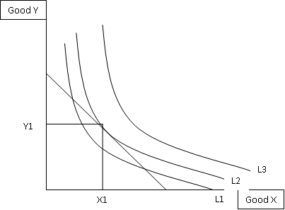
Here you can see that the budget line touches, or is tangential, to the indifference curve L2, which is the highest one it touches. Therefore we can say that the optimum consumption point for these two goods would be X1 of good X and Y1 of good Y. We know the slope of the budget line is Px / Py and we know from the previous blog post that the indifference curve slope at any point is MuX / MuY. Therefore, the optimum consumption point is the point where (Px / Py) = (MuX / MuY)!
A change in income will cause a change to the diagram. The budget line will either shift out or in depending on whether incomes rose or incomes fell. This new budget line would cross and indifference curve at a different point, if you joined the new optimum consumption point and the old one you'd have created a new line that we call the income-consumption curve in economics. As with a change in price of one of the goods, the budget line will pivot and a new optimum consumption point will be formed. Connect the original point and the new point and this line you've created is called the price-consumption curve.
Now for the exciting bit! Actually deriving a consumers demand curve for a good!

Ok, there is a demand curve derived for good X using the indifference curves and budget lines. Look at it, take it in, see if you can see what's going on. It's difficult, I know. Here's my explanation attempt: On the top diagram we have used good X along the bottom and money for all other purposes on the Y axis. We have a set budget and at varying prices of X this budget line is pivoting. Each of these new pivoted budget lines crosses indifference curves at different points to form a price-consumption curve. The points of intersection of each budget line translate down to as the quantities demanded of good X. Now, to work out the prices for the second diagram. Lets look at the first budget line for this. It crosses L1, we can see that. At that point it has translated down to the bottom diagram as Q1. The price here is the same as the slope of the curve.. so assuming we have a budget of £30 I'd say the budget line hits the X axis at roughly 17. So, 30/17 = 1.76, which is the roughly where the point is on the second diagram. If we did the same for the other two budget lines we'd receive prices of 1.2 and 0.94. These are those two other price points you can see on the diagram. Then as with any other demand curve, join the dots to actually complete the demand curve for good X. PHEW!
That's it, finally. It may be difficult to grasp in parts, if it is then comment with where you are finding it difficult and I'll give you a helping hand. I'll get back to you within a few hours normally, so keep checking back! Thanks for reading again guys, have a good day.
Sam.
excellent notes......
ReplyDeleteThanks for that perfect explanation !
ReplyDeletegood
ReplyDeleteCan two budget lines intersect?
ReplyDeletewhat does it mean when two budget lines intersect each other?
ReplyDeletewill the reply be sent to my email?
ReplyDelete