Showing posts with label Budget. Show all posts

Monday, 8 April 2013

Firms and Isoquant Maps

If you read the previous post about indifference analysis then you'll notice a lot of similarities when studying this topic. Isoquant analysis is essentially the same as indifference analysis but from the point of view of a firm. Each isoquant measures the combinations of capital and labour a firm would need to produce a constant output. They follow the same shape as indifference curves, sloping downwards, as you can see below.


The downwards sloping shape is due to the diminishing marginal rate of technical substitution (MRTS). It's the rate at which we can substitute capital for labour and still end up with the same level of output. We have to give up capital to add more labour, hence why there is a negative slope.


An isoquant map is a series of isoquants showing combinations of capital and labour that give different levels of output. It looks very similar to an indifference map. 


Each isoquant represents a different level of output. The further up and to the right you go, the higher the production. From these maps we can see what returns to scale the firm in question is facing. By returns to scale we are talking about the increase in output given an increase in capital and labour. If we doubled both capital and labour and saw a doubling of output then the firm would be facing constant returns to scale. On the isoquant map this is shown by the isoquants being evenly spaced. If we doubled the inputs and received more than double the output then we'd say the firm is facing increasing returns to scale. The isoquants would get closer together when increasing returns to scale was present. Finally, if the firm doubles the inputs and receives less than double the output then the firm is facing decreasing returns to scale. On an isoquant map this would be shown by the isoquants getting further apart. 

 We move on now to isoquants and marginal returns for firms. A marginal return measures the change in output the firm gets when one variables is changed and the other is held constant. Look at the diagram below this paragraph - we'll hold capital constant at 25.


 So, to achieve output of 5000 with capital held at 25 we need 10 units of labour. To get from 5000 to 10000 production we need to add an additional 20 units of labour (30-10). To get from 10000 to 15000 production we need to add an additional 35 units of labour (65-30). We can see that the more labour we add the less productive they become - this shows the principle of diminishing marginal returns. Each additional worker will add less production than the previous one.

Right, now for firms to choose their optimal level of production we need to include their budget into the analysis. This works the same as a budget line. Anywhere along the line gives us combinations of the two inputs with equal costs.


The dotted line above shows an example of changing factor costs and what would happen to the isocost line. Here, the price of labour (wages) have fallen and therefore the firm can afford more of them with a given budget. The line swings out, pivoting around the point on the y axis. If the price of labour rose the line would swing in. If the firm's overall budget increased/decreased then the whole isocost line would shift out/in. 

 Now, firms choose their production in one of two ways. They either go down the route of getting the least cost combination of factors for a given level of output or they aim to maximise output for a given production cost. The two examples can be seen in the diagram below. 


Time to get a bit mathematical now. We are going to work out the equilibrium point of production and what occurs at this point. So, the slope of an isoquant is as follows: If we reduce capital (K) then the loss of output will be: (MPP being the marginal physical product).


 And if we increase labour at the same time, the gain in output will be :


Now, at any point on the isoquant the change in quantity is 0, therefore these two terms must equal each other:


A simple rearrangement and we are left with the following formula for the slope of the isoquant,which equals the marginal rate of technical substitution:


 The slope of an isocost now. The reduction in cost should we reduce capital would be: (- the price of capital times the change in capital). 


The rise in cost if we increase labour will be: 


 Once again, the change in cost along the line is 0 therefore these two will equal each other at all times. Equating these two together and rearranging we get the slope of an isocost as: 


In equilibrium, the slope of the isoquant will equal the slope of the isocost:


 The final rearrangement now, I promise. We can derive this sneaky formula: 


What's interesting about this is that it tells us that money spent on each factor at the margin should yield the same level of additional output for the firm. Interesting. 

 We can map out the firm's costs in the long run on an isoquant map. It is called the expansion path as you can see below. 


 Typically, in the long run the firm will experience a varying level of costs. At low levels of output they will experience economies of scale. Then as output increases there will come a time when costs become constant. As output increase further still they will eventually reach a point of diseconomies of scale - where being a mass producer actually makes things costlier. In the short run costs are always higher than in the long run, always. Why? Because capital stock is fixed, we can only vary the amount of labour we employ. 

 That's it, the firm and isoquants covered. As usual post a comment if something doesn't make sense or you need further clarification - I'd be happy to help. Share the blog if you find it helpful, please. Cheer guys. 
Sam.

Indifference Analysis


Back to a more educational point of view now following the last post I wrote. Today will be a look back, potentially in more detail, at the concept of indifference analysis. I'll try and start at the very basics and work my way through the subject - if you feel I've left anything out do not hesitate to let me know in a comment and I'll try and go over it for you. This post is long, I won't hide that fact. Make full use of the search bar to the left of this to make sure this contains what you're looking for. Even better still, use Ctrl + F and search for keywords. That could save you some time!

Indifference analysis is a basic concept in economics which looks at consumers preferences for two goods. It is an "exactly what it says on the tin" topic - we are looking at combinations of these two goods that the consumer would feel indifferent about. The definition of 'Indifferent' from dictionary.com, by the way, is "having no bias, prejudice, or preference; impartial; disinterested." So, rephrasing it into Layman's terms: we are looking at combinations of these two goods that the consumer would feel equally as happy, content, etc with. This will become evident later on in the analysis.

The very first step in the analysis will be to construct an indifference curve. This is done below.


Here we have an indifference curve. This is modelling different combinations of Good A and Good B that the consumer would feel indifferent about. Anywhere along this curve the consumer will be feeling the same level of satisfaction. Indifference curve slope downwards - that is a general rule. Why? I hear you ask. Well, it's due to the diminishing marginal rate of substitution. This piece of jargon essentially means the rate at which we would swap Good A(Y) for Good B(X) while remaining equally as satisfied. It looks as follows:

                                               
If we used some figures as an example, let's say that the consumer is indifferent between 25 of Good A and 5 of Good B and is also indifferent between 20 of Good A and 6 of Good B. Right. So, the top of the equation would be (20 - 25) and the bottom of the equation would be (6 - 5). That leaves us with -5 as the answer. So, between the points (25,5) and (20,6) on a diagram the slope would be -5. We can focus in on the negative sign here, this shows why the curve is always downwards sloping. We have to give up some of Good A to get more of Good B. Keeping up? Good.

An indifference curve alone tells us very little, an indifference map on the other hand tells us a lot more. An indifference map is a series of indifference curves showing which combinations of two goods give different levels of satisfaction.


If you think of the map as a mountain, starting from the bottom left corner and working diagonally to the right and up - the higher up the mountain we go the more satisfied the consumer. At any point on I4 the consumer is more satisfied than at any point on I2 for example. The question that creeps up a lot regarding indifference curves is "Could they ever cross?" In short, the answer is no. This can be proved via contradiction.


Consider the three points here: a, b and c. From the analysis we've just done we can say that a is indifferent to b. We can also say that a is indifferent to c. So, b 'should' be indifferent to c. But b has more of Good A for the same amount of Good B than c does, and therefore point b would be preferred. b and c aren't indifferent, and therefore indifference curves cannot cross. Bosh!

Now, for a consumer to make a decision about what to consume we need more information than just the indifference curves. We need information on prices and incomes. This is where the budget line enters. I fear I'm stating the obvious here, but I'll have to continue: the budget line is how much of the two goods the consumer can afford. So, it'll have the following formula, which reads 'Price of Good A times the quantity of Good A plus the price of Good B times the quantity of Good B equals the consumers income:


If Good A was £2,  Good B was £1 and the consumer's income was £30 then we'd have an equation to work out: 2A + B = 30. Now we have our equation we can plot the budget line on a graph.


It is literally as simple as that for the budget line. All we need is the price of the two goods and the consumer's income and we can work out the quantities of each good they can purchase. While on the topic of the budget line I think I'll mention what happens to the line when prices and incomes change. If just one price changes then the budget line will swing in or out, pivoting around a point. For example, if the price of Good B fell, then we'd see the line swing out to the right, pivoting around the point on the Y axis. It would swing out because a fall in price of Good B means we can afford more of them. A rise in price causes a swing in. A change in the total budget or consumer's income means a shift in the whole budget line parallel to the current one. A rise in the budget shifts the curve out to the right, a fall in the budget shifts it in to the left. If both incomes and prices rise by the same percentage, or fall by the same percentage for that matter, we see no change in the budget line.

Moving swiftly on, we're ready to combine the indifference map and the budget line. This can give us the consumer's optimal consumption point. Utility or satisfaction for the consumer is maximised at the point of tangency between the budget constraint and the indifference map, as is highlighted in the graph below.


The slope of the indifference curve is the marginal rate of substitution and the slope of the budget constraint is (minus) the relative price of Good A and Good B. Therefore, where these meet, the consumer chooses optimally when MRS = Price of Good B / Price of Good A.

Another piece of jargon you may need to learn is the 'Price-Consumption curve'. This is a curve derived from the changing price of one of the goods. From this curve we can create a demand curve for that good. Clever stuff.


Now, to derive the demand curve from it. We make one alteration to the diagram above, we make the Y axis 'Expenditure on all other goods' instead of just Good A. Then, we follow the points of tangent down and onto a new diagram. On the Y axis of the below diagram we list the prices, which come from dividing the Budget by the quantity of Good B when expenditure on all other goods is 0. Match these prices up to the lines we've just drawn down and Bob's your uncle - a demand line. In words it sounds confusing, take a look at the diagram below and then re-read this until sense is made.


I hope that makes sense - reread and study the diagram.

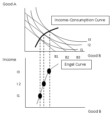
Another 'special' curve we need to be aware of is the Income-Consumption curve. This tracks the effect a change in income has on our optimum choices of the two goods. The slope of this curve tells us about the desirability of Good A and Good B as incomes rise. In general, the curve will look something like this:


There is a special case where the shape of this curve bends the other way. This is when one of the goods is an inferior good - I trust we all know what that means. A higher budget will mean less is demanded and therefore the income consumption curve will bend back on itself.

Bravo to those of you that have made it this far and hello to those that skipped straight to this section. Neither of you will be judged... honest. Finally, we are going to look at the Engel Curve. An Engel Curve shows how the demand for a good changes as income changes. We use the Income-Consumption curve and track it down onto a new diagram below.


If incomes increase and this leads to a demand increase for the good then we are looking at a normal good. If demand decreases it is an inferior good. The final, more peculiar outcome, is in the case of a giffen good. Giffen good prices rise when demand rises, odd - but they do exist.

By gosh, I think we might be finished. I said 'potentially' more in depth at the beginning - I think that word can be scrapped. If you're still unsure of anything Indifference Analysis related then drop me a comment and I'll be happy to try and help you out if I can. Thank you for reading, have a good day!
Sam.

Saturday, 3 November 2012

The Transformation of Policy Between the Wars

Immediately after the First World War, the government's aim for policy was to get the economy back to the 'normality' experienced prior to 1914. This sort of thing included the government playing a limited role in the economy, more integration with the world economy and restoration of the gold standard, free trade and a balance budget.

Initially these three final points are achieved. The budget is eventually balanced, albeit a higher budget than previous years due to the increase social spending and maintenance of the national debt. During the 1920's the policy of free trade is also pretty much restored. Britain gets back on the gold standard in 1925 at the rate of £1 = $4.86. Germany and France both rejoin the gold standard at a similar time, along with most other leading economies. Why did we return to the gold standard you may ask? Well, firstly it helped achieve the restoration of pre-war 'normality'. Also, it aimed to try and stabilise the currency which would in turn help out trade. Another feature of the gold standard was to allow the monetary system to function on its own. What I mean by this, is that if the country runs a payments surplus then gold will flow into the country, interest rates will be decreased so wages and prices will fall. This will in turn cure the surplus. It also works the opposite way for a payments deficit. A final point is that the gold standard was a means of stopping politicians from meddling with the money supply!

However, pre 1914 the gold standard worked but after the war and during the 1920's it just didn't. There is a list of potential reasons for this:


  • Why the gold standard worked pre-1914:
    • It was developed gradually over time.
    • Capital and labour was freely moving.
    • The central bank could use interest rates to protect the currency, independent of the government. 
    • London was still a financial centre.

  • What changed in the 20's?
    • There was a rush to return to the gold standard.
    • More protectionism and less migration due to barriers.
    • Central banks were under pressure from politicians.
    • Paris and New York now competing against London as financial centres. 

Mr. Keynes pops up again in this debate. He pointed out that British prices had risen faster than the US', so starting at the same £1 = $4.86 rate would be an overvaluation of the pound. Although this shouldn't have matter because the gold standard should re-adjust prices, Keynes doubted it would work. He thought it would have bad domestic effects including interest rates needing to be kept at 4.5-4.5% and due to this borrowing would become expensive and investment would suffer.

The world slump is the next chronological step in the economic history of Britain. The recession of 1929 - 1931 started because of the Wall Street Crash in the US. This meant massive balance of payments problems. In 1931 came the European Banking Crisis and so in Autumn of that year Britain was forced off of the gold standard. This was first portrayed as a temporary change, but gradually the realisation came about that it was for good. Interest rates were cut to 2% to encourage borrowing and investment which would boost the economy again! Amazingly, there was a recovery. GDP rose as investment rose and Britain actually now compared well with other global economies. It would be easy to say all of this was because of the gold standard, but it isn't true as many other factors were also contributing to the recovery of the British economy. What the slump did cause, however, is the abandonment of free trade between 1931 and 1932. 

Keynes had the idea that investment from the government was something that was necessary for the economy. But, the treasury wasn't in agreement with this theory. They believed it would unsettle foreign investors and worsen the national debt. Keynes thought that there was no point in cutting wages because demand and consumption would suffer. What was needed was public investment which would boost the economy via the multiplier effect. The treasury argued it would be inflationary and any more borrowing would get out of control. The only time borrowing was allowed was in a one-off circumstance for rearmament!

Thanks for reading again guys, that'll be it for economic history for a while... I promise! Haha.

Sam. 

Thursday, 1 November 2012

The Role of the State and the Challenges of WWI, 1870 - 1921

This post will go into a little bit more depth about how the government ran the economy and the challenges it then faced as Britain went through the First World War. Prior to WWI, Britain was referred to as a 'night watchmen' state. This means the state didn't try and an direct or manage the economy, they only intervened when it came to necessities such as health and safety, company law, basic education and the provision of welfare.

The aim was to maintain a balanced budget and fund any spending through taxation. Due to this, not much really was spent because it would only be justified if the taxpayer paid for it, and to avoid a backlash from high taxes the tax rate remained constant. After 1890 strain on the budget begins to show. Higher grants were needed for welfare and education and defence spending, especially for the navy began to rise. Spending as a percentage of GNP grew. Government spending in 1913 was roughly £305 million, compared to £130 million in 1890. Due to this increase in spending, taxes had to rise to fund it all. A super tax on incomes was introduced in 1909 and income tax for the better off increase to 6% in the same year.

However, despite all this government activity was still relatively constrained. Rules were still in place to make sure the budget remained balanced and spending was only at 13% of GDP in 1913. Some economists believed that the limits on taxation had been reached.

When the war begins in 1914 the government take a 'business as usual' approach. The assumption was that the war would be a short one and that Britain's main role would be more financial than military. Things have to change, though, as the government begins to realise that the war isn't going to be a short one. The railway and sugar industries are a few industries that were controlled at the start of the war and a large army had to be raised, needing to be fed and armed.

This leads us onto the munitions crisis. Arms factories cannot cope with the demand for munitions and shell shortages begin to develop. The reply from the government is to set up the Ministry of Munitions in 1915. This controlled over 2 million workers by 1916 and started to spend a lot of money on the production of more ammunition. Between the years of 1916 and 1917 a lot more industry came under government control, including: shipping, mining and food and raw material imports.

One of the big issues that comes up during war is labour, and it's no different in this case. Women and unskilled male labour are brought in to work in the factories. Unions agree that unskilled workers are allowed to now do tasks that were previously only allowed to be done by skilled workers. Strikes are banned (in theory), but this essentially fails as 11 million working days were lost between 1917 and 1918 due to strikes. As incentives to direct workers into the essential industries, better pay is offered.

The war has to be financed, of course. This meant a massive increase in government spending; up to 59% of GDP which was roughly £2,800 million. 72% of the money is funded through borrowing, leaving to a large national debt being racked up. This is very problematic, the national debt reaches the level of £6.1 billion in 1919 and of course servicing the debt with interest payments because a massive drain on the economy.

Let's move on to the post war stage now. Things look good and bad in a sense, there is a post-war boom due to a lot of money being in circulation. This could be seen as a good thing, however the massive demand outstrips output and this leads to runaway inflation. The other issue at the time was demobilization. This all gets too much and we enter into a slump between 1920 and 1922, by 1921 this is a recession. GDP falls by 7% and unemployment is up at 2.2 million. The big debate is whether this was avoidable or not? Some say it was unavoidable, world conditions were awful and it was impossible to avoid the effects. However, government policy could be said to have worsened things. Policy was too lax in 1919 yet too tight in 1920 and 1921, which didn't help the economy.

Have your own say! That's it for this part of the economic history of Britain, thanks for reading.

Sam.

Thursday, 18 October 2012

Principles of Economics: The Budget Line (Microeconomics)

This post will make the next logical step on from indifference analysis by introducing the concept of the budget line. The budget line shows us the combinations of two goods that can be purchased with a given income to spend on them at their set prices. You guessed it, a graph is coming! The easiest way to show a budget line is for me to construct a diagram. Here is it, this is a budget line for good X and good Y assuming good X costs £2 and good Y costs £1 and the budget available is £30.

The area above the line isn't feasible to achieve given the prices of the two goods and the budget available. If incomes were to increase, say to £40 or the prices of both goods were to fall by the same percentage we would see the budget line shift as is shown in this next diagram. The rule is, changes in income or equal changes in price will cause the budget line to shift parallel to the original curve. Here's the new curve with an increased budget of £40:

The slope of the line here represents the relative price of the two goods. So in the example above it was 30/15 = 2 for the first line and 40/20 = 2 for the second line. The rule of thumb for that is Price of Y / Price of X. Prices can also change independently of each other, as we well know. If one price changes and the other doesn't, this causes a pivot on the diagram. If good X changed from £2 to £1 we'd see a pivot around the initial point on the Y axis. This next diagram will show that:

The pivot here is quite clear, as the price of good X decreases it means more can be consumed while the consumption of good Y remains constant. 

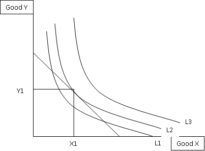
Next, we'll move on to a more complex concept - the optimum consumption point! This is where we combine the budget line from above and the indifference curves from the blog post I did a few days back. By definition, the optimum consumption point will be where the budget line touches the highest indifference curve on an indifference map. As with most concepts, this is also much easier to understand when represented on a diagram:

Here you can see that the budget line touches, or is tangential, to the indifference curve L2, which is the highest one it touches. Therefore we can say that the optimum consumption point for these two goods would be X1 of good X and Y1 of good Y. We know the slope of the budget line is Px / Py and we know from the previous blog post that the indifference curve slope at any point is MuX / MuY. Therefore, the optimum consumption point is the point where (Px / Py) = (MuX / MuY)!

A change in income will cause a change to the diagram. The budget line will either shift out or in depending on whether incomes rose or incomes fell. This new budget line would cross and indifference curve at a different point, if you joined the new optimum consumption point and the old one you'd have created a new line that we call the income-consumption curve in economics. As with a change in price of one of the goods, the budget line will pivot and a new optimum consumption point will be formed. Connect the original point and the new point and this line you've created is called the price-consumption curve. 

Now for the exciting bit! Actually deriving a consumers demand curve for a good!  


Ok, there is a demand curve derived for good X using the indifference curves and budget lines. Look at it, take it in, see if you can see what's going on. It's difficult, I know. Here's my explanation attempt: On the top diagram we have used good X along the bottom and money for all other purposes on the Y axis. We have a set budget and at varying prices of X this budget line is pivoting. Each of these new pivoted budget lines crosses indifference curves at different points to form a price-consumption curve. The points of intersection of each budget line translate down to as the quantities demanded of good X. Now, to work out the prices for the second diagram. Lets look at the first budget line for this. It crosses L1, we can see that. At that point it has translated down to the bottom diagram as Q1. The price here is the same as the slope of the curve.. so assuming we have a budget of £30 I'd say the budget line hits the X axis at roughly 17. So, 30/17 = 1.76, which is the roughly where the point is on the second diagram. If we did the same for the other two budget lines we'd receive prices of 1.2 and 0.94. These are those two other price points you can see on the diagram. Then as with any other demand curve, join the dots to actually complete the demand curve for good X. PHEW!

That's it, finally. It may be difficult to grasp in parts, if it is then comment with where you are finding it difficult and I'll give you a helping hand. I'll get back to you within a few hours normally, so keep checking back! Thanks for reading again guys, have a good day.

Sam. 


Saturday, 29 September 2012

European Economic Issues: Background to the EU

The European Union we know today was formed back in 1957 wen the Treaty of Rome was signed and it came into operation on the 1st of January. It was initially called the European Economic Community. Initially, it had six member states whom had started to integrate their economies as early as 1952 with the European Coal and Steel Community which removed trade restrictions between the countries in an attempt to gain economies of scale and be able to compete with the U.S.A. Most internal tariffs had been abolished and common external tariffs introduced by 1968. However, the European Union at this point was still a 'customs union' rather than a 'common market' because restrictions were still in place on trade (legal, administrative and fiscal).

Many policies were in place at this point that made the EU a very integrated economy, these include:

  • Common Agricultural Policy - Includes common high prices for farm products and import duties to bring foreign food up to EU prices.
  • Regional Policy - Grants to firms and local authorities in deprived regions.
  • Competition Policy - For example, Article 81 of the Amsterdam Treaty says that agreements between firms cannot be made if it will affect competition in trade between member states. 
  • Taxation - VAT is the standard form of indirect tax through the EU.

A further move towards making the EU a single market came in 1987 with the Single European Act. This aimed to remove any extra barriers and form a common market by 1992 using the principle of mutual recognition. This meant that if a firm could do something under the rules of one EU country that firm could do it in all EU countries. It stopped individual governments from making special rules that would keep competition from other EU countries out. In June 1997, the 'Action Plan' aimed to remove any remaining barriers before the launch of the euro currency in January 1999. The 'Internal Market Scoreboard' was published every six months to show the progress made towards the abandonment of restrictions. The last two nations joined the EU in 2007: Bulgaria and Romania to make it 27 members. 

The EU now consists of 27 states. These states are classed into different categories depending on the population of the countries. For example, 6 'big' nations are part of the EU. A 'big' nation in terms of population means that the population is greater than 35 million. Germany and the United Kingdom are two of these 6 'big' countries. Next comes the mid-sized countries of which there are two: Romania (22 million) and the Netherlands (16 million). Smaller than these still are the 'small' countries with a population of between 8 and 11 million, this category includes Greece and Belgium. Finally the rest of the countries are referred to as 'tiny' nations making up less than 5% of the EU25's population between them. Examples of these 'tiny' nations are Denmark and Finland.


As with population, the EU nations can also be categorised based on their income per capita. This is GDP divided by population and is a good way of comparing the wealth of a country with another. 12 countries fall into the 'high' income category. As you'd expect, Germany and the U.K are in this category as well as the likes of Denmark and Italy. 7 countries are classed as medium income; Greece, Portugal and Cyprus are examples of this. The rest of the EU nations fall under the low income band. Luxembourg is the richest country when looking at income per capita, they have an income per capita that's more than double France. The poorer countries have generally done better economically since joining the EU. Here is a graph to show the income per capita figures graphically, taken from the Eurostat website.

Source: http://epp.eurostat.ec.europa.eu/tgm/graph.do?tab=graph&plugin=1&pcode=tec00114&language=en&toolbox=sort


The economies in the EU are very uneven in their sizes. For example, the following six nations together make up over 80% of the EU's economy: Germany, France, Italy, Spain, Netherlands and the United Kingdom. The rest of the countries are once again sorter into categories such as 'small', 'tiny' and 'minuscule' depending on the size of their economy. 'Small' is an economy that accounts for between 1% and 3% of the EU's overall economy. Sweden and Belgium, for example. 'Tiny' is an economy that accounts for less than 1% of the EU's overall economy and Hungary and Belgium fall under this title. Finally, 'minuscule' refers to an economy that makes up less than one tenth of 1% of the EU's economy (Latvia, Estonia, Malta).

EU countries tend to most of their trading with, well, themselves. Roughly two thirds of imports of exports are to or from Western Europe. Exports to North America make up roughly 10% of the total and to Asia even less, around 8%. About 80% of these EU exported goods are industrial goods.

The EU's budget has to balance each year. The four sources of funding for the budget are tariff revenue, agricultural levies, VAT resource and GNP based (A tax paid by members based on their GNP). All countries tend to contribute roughly 1% of their GDP to the EU budget, meaning it's not a 'progressive' tax. Germany and the United Kingdom are at the top of the spectrum of countries that donate a lot more than they receive in benefit from being part of the EU, whereas Spain and Greece gain a lot more in benefits than they donate to the EU. The majority of the EU budget is spent on agriculture, roughly 46%, hence the Common Agricultural Policy we hear a lot about.

That's a rough insight into the background and habits of the EU. I wanted to lay some foundations for some of the posts on European economic issues that are to come. Thank you for reading, stay tuned!

Sam.

Sunday, 9 September 2012

Protectionism (Macroeconomics)

Protectionism refers to the protection of a domestic industry from foreign competition. There are many types of protectionism which i'll run through later on in this post. The free movement of goods and services is restricted between countries and economic blocs to try and protect a countries own industries from the powers of competition from abroad. The main types of protectionism are as follows:


  • Tariffs
  • Quotas
  • Voluntary Export Restraints
  • Foreign Exchange Restraints
  • Embargoes
  • Red Tape

Tariffs is very much self-explanatory. A tariff, or tax, on a good being imported into the country from abroad.  The effect of the tariff will be moving the supply curve of the good backwards by the value of the tariff. A tariff will protect domestic firms, especially new firms, by making it more expensive for goods to be imported and therefore raising the price, allowing home-grown firms to compete more. It's useful when it comes to goods from the likes of China and India. These countries have such low costs of production that they can afford to sell the goods at prices much lower than those of domestic firms in the United Kingdom. Therefore, these tariffs add to the production cost meaning that imported goods will cost more and allow domestic firms to compete more. 

A quota is also a fairly self-explanatory form of protectionism. It is a limit on the supply of a good or service into a country from abroad. An example would be a quota restriction on the import of t-shirts from China. The government may create this quota in the form of a number of goods, i.e 20,000 t-shirts per year, or they could do it by value, i.e £4 million worth of t-shirts per year. Supply of the good will fall which will in turn help domestic industries once again to compete as well as potentially raise the price of the goods. A problem with quotas, however, is that it can cause international disputes such as the one between China and the EU about the importing of Chinese textiles. More can be read about that by clicking here.

Voluntary export restraints are an agreement between one country and another to limit their exports to each other of certain goods. This is normally made between countries who are on good terms with one another or who are in the same economic bloc. Foreign exchange restrictions are a type of protectionism that doesn't appear much. This is when a government seeks to reduce imports by limiting the amount of foreign exchange made available to those within the country who wish to buy imported products. Basically, the supply of foreign money to buy these imports will be limited so not as may goods can be purchased from abroad. 

The final two now: embargoes are a ban on the import or export of products to/from a particular country. For example, a ban on weapons to a country with poor human rights records. Red tape is the idea of making importing difficult by creating lots of paperwork and procedures to delay and therefore discourage the imports. 

There is, of course, an argument for going ahead with protectionism. Firstly and potentially most importantly, it gives the government the ability to control imports which can therefore improve the trade balance. If the trade balance is in the red the government can use any form of protectionism in an attempt to curb spending on imports and improve the trade balance. Protectionism is very beneficial to declining domestic industries as well as the new industries. Both these industries aren't at the stage to be totally competitive and therefore could easily be wiped out from cheap imports. However, protecting them by limiting imports or raising the price allows these firms to get a proper foot in the market, expand and grow enough to be able to compete with the cheaper imported goods and services. Finally, it's also a method for generating revenue for the government if the protectionism comes in the form of a tariff. This tariff placed by the government goes straight in their pocket and can therefore help to eradicate budget deficits as well as improve investment power. 

With all advantages does come disadvantages, and the case of protectionism is no exception. Consumers will experience a welfare loss due to higher prices and the loss of consumer surplus. It can also be regressive for low income families as the protection will effect everyone equally, therefore those with less money will feel it the most. Raw materials may well become more expensive. This is far from beneficial for domestic industries as production costs will rise and therefore profits will be squeezed. Retaliation is another big thing that could crop up as a direct result. Putting a form of protectionism on imports from a certain country could cause that country to do the same back, which will restrict the exporting potential of the country and could worsen the balance of trade.  Finally, maybe a minor disadvantage, but there is the administration and implementation costs of the protections to take into account.

That pretty much sums up protectionism for you. Decide or yourselves whether you think they're beneficial or not, but at the end of the day forms of protectionism will always be used. Thanks for reading guys, stay tuned and share the blog if you find it useful!