Monday, 8 April 2013

Indifference Analysis


Back to a more educational point of view now following the last post I wrote. Today will be a look back, potentially in more detail, at the concept of indifference analysis. I'll try and start at the very basics and work my way through the subject - if you feel I've left anything out do not hesitate to let me know in a comment and I'll try and go over it for you. This post is long, I won't hide that fact. Make full use of the search bar to the left of this to make sure this contains what you're looking for. Even better still, use Ctrl + F and search for keywords. That could save you some time!

Indifference analysis is a basic concept in economics which looks at consumers preferences for two goods. It is an "exactly what it says on the tin" topic - we are looking at combinations of these two goods that the consumer would feel indifferent about. The definition of 'Indifferent' from dictionary.com, by the way, is "having no bias, prejudice, or preference; impartial; disinterested." So, rephrasing it into Layman's terms: we are looking at combinations of these two goods that the consumer would feel equally as happy, content, etc with. This will become evident later on in the analysis.

The very first step in the analysis will be to construct an indifference curve. This is done below.


Here we have an indifference curve. This is modelling different combinations of Good A and Good B that the consumer would feel indifferent about. Anywhere along this curve the consumer will be feeling the same level of satisfaction. Indifference curve slope downwards - that is a general rule. Why? I hear you ask. Well, it's due to the diminishing marginal rate of substitution. This piece of jargon essentially means the rate at which we would swap Good A(Y) for Good B(X) while remaining equally as satisfied. It looks as follows:

                                               
If we used some figures as an example, let's say that the consumer is indifferent between 25 of Good A and 5 of Good B and is also indifferent between 20 of Good A and 6 of Good B. Right. So, the top of the equation would be (20 - 25) and the bottom of the equation would be (6 - 5). That leaves us with -5 as the answer. So, between the points (25,5) and (20,6) on a diagram the slope would be -5. We can focus in on the negative sign here, this shows why the curve is always downwards sloping. We have to give up some of Good A to get more of Good B. Keeping up? Good.

An indifference curve alone tells us very little, an indifference map on the other hand tells us a lot more. An indifference map is a series of indifference curves showing which combinations of two goods give different levels of satisfaction.


If you think of the map as a mountain, starting from the bottom left corner and working diagonally to the right and up - the higher up the mountain we go the more satisfied the consumer. At any point on I4 the consumer is more satisfied than at any point on I2 for example. The question that creeps up a lot regarding indifference curves is "Could they ever cross?" In short, the answer is no. This can be proved via contradiction.


Consider the three points here: a, b and c. From the analysis we've just done we can say that a is indifferent to b. We can also say that a is indifferent to c. So, b 'should' be indifferent to c. But b has more of Good A for the same amount of Good B than c does, and therefore point b would be preferred. b and c aren't indifferent, and therefore indifference curves cannot cross. Bosh!

Now, for a consumer to make a decision about what to consume we need more information than just the indifference curves. We need information on prices and incomes. This is where the budget line enters. I fear I'm stating the obvious here, but I'll have to continue: the budget line is how much of the two goods the consumer can afford. So, it'll have the following formula, which reads 'Price of Good A times the quantity of Good A plus the price of Good B times the quantity of Good B equals the consumers income:


If Good A was £2,  Good B was £1 and the consumer's income was £30 then we'd have an equation to work out: 2A + B = 30. Now we have our equation we can plot the budget line on a graph.


It is literally as simple as that for the budget line. All we need is the price of the two goods and the consumer's income and we can work out the quantities of each good they can purchase. While on the topic of the budget line I think I'll mention what happens to the line when prices and incomes change. If just one price changes then the budget line will swing in or out, pivoting around a point. For example, if the price of Good B fell, then we'd see the line swing out to the right, pivoting around the point on the Y axis. It would swing out because a fall in price of Good B means we can afford more of them. A rise in price causes a swing in. A change in the total budget or consumer's income means a shift in the whole budget line parallel to the current one. A rise in the budget shifts the curve out to the right, a fall in the budget shifts it in to the left. If both incomes and prices rise by the same percentage, or fall by the same percentage for that matter, we see no change in the budget line.

Moving swiftly on, we're ready to combine the indifference map and the budget line. This can give us the consumer's optimal consumption point. Utility or satisfaction for the consumer is maximised at the point of tangency between the budget constraint and the indifference map, as is highlighted in the graph below.


The slope of the indifference curve is the marginal rate of substitution and the slope of the budget constraint is (minus) the relative price of Good A and Good B. Therefore, where these meet, the consumer chooses optimally when MRS = Price of Good B / Price of Good A.

Another piece of jargon you may need to learn is the 'Price-Consumption curve'. This is a curve derived from the changing price of one of the goods. From this curve we can create a demand curve for that good. Clever stuff.


Now, to derive the demand curve from it. We make one alteration to the diagram above, we make the Y axis 'Expenditure on all other goods' instead of just Good A. Then, we follow the points of tangent down and onto a new diagram. On the Y axis of the below diagram we list the prices, which come from dividing the Budget by the quantity of Good B when expenditure on all other goods is 0. Match these prices up to the lines we've just drawn down and Bob's your uncle - a demand line. In words it sounds confusing, take a look at the diagram below and then re-read this until sense is made.


I hope that makes sense - reread and study the diagram.

Another 'special' curve we need to be aware of is the Income-Consumption curve. This tracks the effect a change in income has on our optimum choices of the two goods. The slope of this curve tells us about the desirability of Good A and Good B as incomes rise. In general, the curve will look something like this:


There is a special case where the shape of this curve bends the other way. This is when one of the goods is an inferior good - I trust we all know what that means. A higher budget will mean less is demanded and therefore the income consumption curve will bend back on itself.

Bravo to those of you that have made it this far and hello to those that skipped straight to this section. Neither of you will be judged... honest. Finally, we are going to look at the Engel Curve. An Engel Curve shows how the demand for a good changes as income changes. We use the Income-Consumption curve and track it down onto a new diagram below.
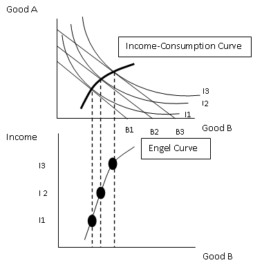

If incomes increase and this leads to a demand increase for the good then we are looking at a normal good. If demand decreases it is an inferior good. The final, more peculiar outcome, is in the case of a giffen good. Giffen good prices rise when demand rises, odd - but they do exist.

By gosh, I think we might be finished. I said 'potentially' more in depth at the beginning - I think that word can be scrapped. If you're still unsure of anything Indifference Analysis related then drop me a comment and I'll be happy to try and help you out if I can. Thank you for reading, have a good day!
Sam.

Thursday, 4 April 2013

Is It Worth It?


I'll firstly apologise for the very philosophical/open/misleading title, what you're about to read is probably going to be a gargantuan let-down but I needed something to draw you in... and here you are - suckers. It is relevant, I promise you that.

So I've spent the past week following a very monotonous (emphasis on the word monotonous  regime of waking up, revising and then sleeping. Midway through an 'Applied Economics and IT Skills' exercise (yawn!) today I just lost all motivation; all my focus just vanished. Poof. I was sat thinking to myself "Is it worth it?" (I told you it was relevant!). Will the endless hours spent with my head buried in a textbook, drinking semi-lethal amounts of caffeine-filled drinks  actually produce a worthwhile output when results day comes around? I can feel any shreds of a social life I once had slowly disintegrating with every new note I write. I want it to all be worth it, but how do I know it will be? The only conclusion I came to is "I don't" - you can now refer back to the part where I mentioned 'gargantuan let-down' in the first paragraph and nod your head frustratingly. I'm sorry.

The fact is though, there is no way of proving that the grade you get on results day is due to the many hours/lack of revision you did in the build up. What's to say that you wouldn't have got that grade had you followed a different route during your exam preparation? I'll tell you what: nothing. The 'wonders' of revision and exam preparation are hammered into us through the many years of education without any solid evidence to prove it works. Odd.

However, we can make an educated assumption that it does no harm to revise - it just may not do any good either. That's the key point, I think. You have to bear in mind throughout the process that if the studying is sending you in any direction, then that direction is upwards. Commit 3 hours to revision or 123 hours, it doesn't matter, you can be safe in the knowledge that your grade will not be falling because of it. With that being said I implore you to keep going, your time isn't being wasted.

I guess this post is an over-ambitious attempt to motivate others, in the blind hope that it will motivate me. Surprisingly enough it has worked: Sam 1, revision 0. You can keep your motivational speaker offers for your charity event to yourself, I'm not interested - and if that isn't good enough, then I'm otherwise occupied. I can't help but pick up on the irony of the situation though - I'm talking about motivating you to revise while at the same time I'm procrastinating on another level writing this article. Funny, but we'll move swiftly away from that.

Take care, guys.
Sam

Monday, 14 January 2013

The Short-run Macroeconomic Equilibrium

A very simplified Keynesian model is used to show the short-run macroeconomic equilibrium. For example, the rate of interest is fixed to simplify the model by keeping constant money in the economy. It is also assumed that production and employment depend on the amount of spending. In that we mean that if people buy more then firms will produce more, providing that they have the spare capacity available. The basic formula we use is that the level of National Income is equal to the domestic consumption plus the three withdrawals from the circular flow of income. Or, in shortened terms: Y = Cd + W. In this model, aggregate demand is actually known as aggregate expenditure (E) and relies on the amount of domestic consumption and the injections into the circular flow of income (J). Also written as AD = E = Cd + J. We reach a point of equilibrium when withdrawals equal injections and at this same point National Income will equal aggregate expenditure. If injections were to be higher than withdrawals then National Income would rise and the withdrawals would rise until withdrawals is once again equal to injections. Now enter the 45 degree line.

The 45 degree line shows the relationship between National Income and consumption, withdrawals and injections. Consumption and withdrawals are endogenous - their value is determined by the model. However injections are exogenous, meaning their value is determined independently of the model.

At ever point on the 45 degree line (Y), the items on each axis equal each other. The C line is consumption. It differs from Cd because it doesn't contain taxes and export spending. Consumption is a function of National Income: C = f(Y). As National Income rises, so does consumption - hence the upwards slope. It crosses the 45 degree line because poorer people may be required to spending above their earnings to survive where as richer people spend less than they earn, therefore at the end of the line it is below the Y line. The slope is given by the marginal propensity to consume - the proportion of any increase in National Income that goes on consumption. It is the change in consumption divided by the change in National Income. 

Consumption is determined by a whole bunch of different things: 
  • Taxes
  • Expected future incomes
  • Expected future prices
  • Consumer confidence
  • Household wealth 
  • Attitudes of the lenders
  • Age of 'durables'
  • Distribution of income
Any changes in these cause a shift in the consumption function whereas a change in National Income causes a movement along the consumption function. 

Now onto the withdrawals. The amount saved depends on the marginal propensity to save (mps). The proportion of an increase in National Income that is saved. Mps = Change in savings / Change in N.I. Taxes is pretty much the same - it depends on the marginal propensity to tax (mpt), or changes in tax / changes in N.I. It tends to rise as National Income rises because income tax is progressive. Finally imports - depending on the marginal propensity to import. Or, mpm = change in imports / change in National Income. 

Total withdrawals will look something like this: 


Injections now and we'll start with investment. It is determined by the following things: Consumer demand, expectations, interest rate, availability of finance and cost/efficiency of capital equipment. Replacing new equipment will rely on National Income. Government spending is independent of National Income in the short term, Exports is also classed as independent on National Income to keep the model simpler.  

That's it for the background on the theory. Next we'll be moving on to how National Income is determined from all of this. Stay tuned.

Sam. 


Tuesday, 8 January 2013

The Circular Flow Of Income

*I'd like to start by wishing everyone a happy new year! I hope you all had a good time over the festive period and are getting back into the swing of things as life returns to normal. I've had a great 4 week break and am now back studying, which mean the blog will be starting again on a consistent basis until Easter!*

Today's focus will be on the circular flow of income. I'm aware this has already been discussed but like I mentioned in a previous post I do plan on going over things again in a little more depth. The best way to learn about the circular flow of income is to actually see the flow graphically:


I'll now break the flow down into it's different sections, starting with the inner flow. The inner flow consists of the factors payments going from the firm to the households and payments for goods (consumption) flowing in the opposite direction. Firms pay money to households in the form of wages, interest and rent in return for the services of these factors of production. On the other side, households pay money to firms when they consume the firms goods and services. Note we're talking only about domestic firms and domestic households here.

In a scenario where all money was spent then that would complete the flow. However, in reality, not all money is spent. This is where the concepts of injections and withdrawals from the flow come in. Withdrawals are exactly what they sound like: money being taken out of the flow. It comes in three main forms. Firstly, savings. When money is deposited in banks or other financial institutions for the future that money has been withdrawn from the flow. Taxation is another withdrawal. Income tax and national insurance comes out of a households income whereas VAT comes out of a households consumption. Receiving benefits from the government is essentially a 'negative tax'. It's a tax that is flowing in the opposite direction. Therefore the total withdrawal in the form of net taxes is total taxation minus benefit payments. The final withdrawal is import spending. This is money that has left the flow of income because it is spent on goods and services abroad.

Injections, defined as additional money flowing into the economy, also comes in three forms. Firstly: investment. Investment is money that firms spend after gaining it through financial institutions. Secondly there is government spending. This includes such things as spending on roads, hospitals, schools and the like. It does not include state benefits, that is important to note! Finally, the other injection is export spending. Money that has come from people abroad buying our domestic goods and services.

There is a slight relationship between the withdrawals and injections into the circular flow of income. For example, suppose more money is saved (withdrawal) then more money will be available for banks to lend out to firms for investment (injection). The higher taxation is (withdrawal), the more like the government are to increase spending (injection). However, we must remember that these choices are made by different people. The choice to save and the choice to invest are made by two completely different, independent parties and therefore each will have their own agenda. Due to this we can say that injections may not equal withdrawals, however they could.

The final point I'd like to discuss here is equilibrium in the circular flow if income. Like most things in economics, market forces are able to bring the circular flow to equilibrium. I'll give an example. Suppose that injections exceed withdrawals. This may be because investment has rise, but irrespective of the reason due to  this national income will rise (because of more money circulating). A higher national income means that people can consume more, but as well as this people can also save more, pay more taxes and buy more imports. Therefore withdrawals will rise, and continue to rise up to a point where it is equal to injections. This is when equilibrium has been reached and national income will remain constant until another change occurs.

Thank you for reading guys and girls. Contact me if you have any questions or feedback, have a good day/night! Sam.

Thursday, 20 December 2012

Principles of Economics - Perfect Competition

Perfect Competition is a market structure that follows these assumptions:

  • Firms are price takers - each firm has no impact on the price in the market, they take the price the market forces set.
  • Freedom of entry into the market - there are low barriers to entry so anyone could potentially set up in this market.
  • Firms produce identical products - the taxi market for example, each taxi firm offers an identical product.
  • Producers and consumers have perfect knowledge - both producers and consumers know everything there is to be known about the market.

However, few, if any, industries are actually perfectly competitive.

In the short run, the number of firms is fixed. In the long run, if supernormal profits are being made then new firms will enter the industry. If losses are being made, firms will leave the industry. 

Short run equilibrium of the firm:


This is what the market looks like in the short run in perfect competition. The price is Pe, and is set by the demand and supply forces. It is horizontal because firms are price takers. Due to price being constant, the red dotted line is also the average revenue, the marginal revenue and the demand for the firm as they're all the same. Qe is the amount produced by the firm because this is the amount at which profits are maximised (MC = MR). There is slight profit being made because the average revenue is higher than the average cost at the production point.

This is where the long run can be introduced. In the long run, firms see these profits being made and enter the industry. These means the industry supply increases, shifting the supply curve to the right on the left hand diagram above. Price falls, which means each firms demand falls until the point it is equal to the average cost. At this point, firms break even and make no profit. Firms will stop entering the industry now.

As far as the public interest goes with perfect competition, it has its benefits and drawbacks. The benefits are as follows:

  • Firms produce at the least cost output.
  • Firms that are inefficient will be forced out.
  • Prices are minimised.
  • Consumers determine what and how much is produced.

The drawbacks are:
  • There us very little incentive to invest in new technology.
  • Goods are all the same, lack of variety for consumers.

That ties up this post about perfect competition. Thank you for reading, keep checking back and sharing. Have a good day!

Sam.


Saturday, 1 December 2012

Common Agricultural Policy Part 3 - Buffer Stocks

A tool at the EU's disposal within the CAP is buffer stocks. They can use these to either stabilise the prices of farm produce or to stabilise farmers income.

First case we'll analyse is the case of buffer stocks being used to stabilise prices of farm produce.


We have a market for a crop here, Q1 and P1 being the equilibrium quantity and price respectively. Lets assume one year there is a good harvest, supply increases to S1. We notice that this would create a fall in price, however as the policy is aiming to stabilise prices this isn't what we want. So, in order for this supply increase to come with stable prices, the governments need to buy up the difference between Q1 and Q2 and put them into buffer stocks. This means, the quantity available to the public is the original level of Q1, and therefore price won't change. 

Alternatively, if there is a bad harvest and supply falls to S2, a price rise would occur. The governments would have to intervene here and sell the difference between Q1 and Q3 to the market, releasing them from buffer stocks so the quantity available is the same and therefore the price remains stable. 

The areas on the diagram represent a few different things. Area a is an income that the farmers are guaranteed, even in the worst times. Area a + b is the normal income for a farmer, assuming that the harvest is a normal one. Area c is extra income the farmer would earn given a good harvest. Notice this policy of stabilising the farming prices has created more fluctuation in the farmers incomes, something the CAP aims to eradicate. Controversial.

Now, onto how buffer stocks can be used to stabilise a farms income. This involves using the elasticity formula. If elasticity of the good equals to 1, then the percentage increase in quantity is the same as the percentage fall in price. Therefore, if these are the same then the income of the farmer will remain constant. 


This diagram shows the principle of stabilising a farmers income using buffer stocks. We have an initial equilibrium of P1 and Q1, and supply increases because of a good harvest. This essentially means that a new equilibrium will be formed at P2 and Q2. However, at this point the farmers income has changed because demand doesn't have unitary elasticity. Therefore, the government needs to intervene. Using the curve above, we can see where the price and quantity should be for farmers income to remain stable: P2' and Q2'. So, what the government needs to do is buy up the difference between Q2 and Q2' and put them into buffer stocks. This means that the quantity now available will mean that price is at P2' and therefore farmers income will be stable. We can see this visually, the farmer has lost area c in terms of income due to the price fall,but gained area a + b due to the increase in quantity. These areas should be identical and therefore the farmers income has remained constant. 

This concept also works the other way if supply were to fall. Just in this case the governments would be releasing from the buffer stocks in order to regulate the price and quantity so that the farmers income remains stable. 

Buffer stocks is one method the government has to try and stop price fluctuations or income fluctuations, however it cannot be used to control both at the same time. Next up will be the use of subsidies for the same reasons. 

Sam.

Statistics - Sampling Methods and Estimation

In statistics we have to use samples because it's normally near on impossible to get data for the entire population. As long as the sampling is done well, the results will usually be good enough. Logic would tell you that the larger the sample, the better.. and this is true. There are two concepts we need to understand here, those are random sampling and sampling distribution.

  • Random sampling - The goal of this is representativeness, we aim to get an equal probability of selection to every member of the population. There are a few methods:
    • Simple random sampling - A sample so that every item or person in a population has the same chance of being included.
    • Systematic random sampling - Items or individuals are arranged in some sort of order. A random starting point is selected and then every nth member is selected. Alphabetic order for example. 
    • Stratified random sampling - A population is divided into sub groups (strata) and a sample is selected from each strata.
    • Cluster sampling - A population is divided up into primary units and then samples are selected from the primary units.
    • Non-probability sampling - Inclusion in the sample is based on the judgement of the person selecting the sample. (Eeek!)

  • Sampling Distribution - This is the theoretical distribution of a statistic for all possible samples of a certain sample size, N. It's a device to link the samples characteristics to the population.
    • If repeated sample sizes of size N are drawn from a normal population with a mean of mew and a standard deviation, σ, then the sampling distribution of sample means will be normal with a mean of mew and a standard deviation of σ / SqrRoot(N).
    • The 'Central Limit Theorem' states that if repeated samples of size N are drawn from a population, as N becomes large the sampling distribution or sample means will approach normality.
    • Or, in easier terms: Large samples are more reliable!

The more basic method of estimation is confidence intervals. From a sample we don't know the population mean, but we would like to estimate this with maximum efficiency. To do this we use a range, and say how certain we are that this range includes the population mean. We give a confidence interval in the form of a percentage, for example we could say that at a 99% confidence interval, between 33% and 39% of adults will vote for Labour in the next election (Made up!). A bigger confidence interval is more likely to contain the true population mean.

The next post will go further into the concept of confidence intervals and we will introduce such things as error margins. Stay tuned, thanks guys!

Sam.