Wednesday, 10 April 2013

Monopoly, Monopolistic Competition and Oligopoly

Before we look specifically at any of the three market structures in the title we should take a closer look at revenue as this will be important in the analysis. When price varies with output, which it does in all market structures bar perfect competition, the demand curve is downwards sloping. Average revenue equals (total revenue) / (quantity). This is the same as (price x quantity) / quantity. Cancel out the two quantities and we're left with average revenue being equal to price - hence it is equal to the demand curve.

Average Revenue and Marginal Revenue

So, the average revenue curve is sloping downwards because it is equal to price. Why the position and shape of the marginal revenue curve then? Well, as we know, marginal revenue is equal to the change in total revenue divided by the change in quantity. If we substitute in price x quantity for total revenue we are left with: 


If we use the product rule to differentiate this (Google this or find a text book, I'm not going to explain the pure math behind it) we're left with marginal revenue being equal to: 


The change in price over the change in quantity will give us a negative figure, so what we're left with is Price + something negative. Due to the "+ something negative" it will be falling below the AR curve, hence its position on the diagram above.

The total revenue curve interacts nicely with the marginal revenue curve we can see above. The total revenue curve increases at a decreasing rate. Why? Well, because to sell more the firm has to lower its price. Due to this, there will come a point when total revenue is maximised. This will coincide with the quantity at which marginal revenue is equal to 0. That quantity will be the revenue maximising quantity for the firm.
Now that we've understood the concept of revenue, let us hone in on the specific market structures. We'll start with monopoly. In a monopoly we have one firm that dominates the market. How do they do this? It is largely due to the barriers to entry into the market. They could be any of the following:

·         Economies of scale.
·         Legal restrictions.
·         Aggressive tactics.
·         Product differentiation.

...the list does go on. These all make it very difficult for new firms to break into the market and pose any sort of competition/threat to the existing monopoly firm. Graphically, a monopoly looks as follows:


They produce at the point MC = MR because this is where profits are maximised. At this point there is a difference between average costs and average revenue, revenue exceeds costs which means that the monopoly is making a supernormal profit. All pretty obvious thus far. Monopoly is probably the easiest of the market structures to master, all there is to remember is that supernormal profits are made in the long and in the short run. To the consumer a monopoly may seem to be a disadvantage - higher prices and lower output compared to perfect competition. This is true, but it does have its advantages. Firstly, supernormal profits fuel innovation which can lead to better, cheaper products in the long run. Secondly, if the economies of scale are big enough then through a monopoly some markets can exist that wouldn't be possible if monopolies weren't allowed. This is in the case of a natural monopoly.

Natural monopolies are markets that have very high, fixed  start-up costs. So high that it becomes unprofitable if more than one firm try and provide the good/service. An example would be the London Underground - massive start up costs in laying the foundations of the network. So, if there were two firms in the market a loss would always be made and therefore production wouldn't occur at all. See this diagram below.


If there was two firms trying to run versions of the Underground simultaneously then neither would be able to stay afloat only serving half of the market each - whereas one firm serving the whole market means it is affordable. With two firms, the demand curve above with slope down at twice the rate meaning it is always below the long run average costs curve, meaning a loss will be made. The scale of production that comes with a natural monopoly means that costs can be lower and therefore the market price can be something consumers will be willing to pay.

That's the low down on monopolies. Now to move onto monopolistic competition. Do not get the two confused - similar names yet totally different market structures. In a monopolistic market firms sell a different variety or different brand of the same product. There are many firms that all act independently of each other with freedom of entry and exit into the market. There is symmetry in the market - new firms entering the market effect all old firms equally.


1 = Firm demand. 2= Firm demand after new competitor enters.
Each firm has a share of the whole industry, but can only influence the price minimally, hence the inelastic demand curve for the firm. Every time a new firm enters the industry all existing firms will see their demand decrease and the influence they have on industry price fall. Every new firm that enters moves the market closer to perfect competition.

A firms profit in the short run looks strikingly similar to that of a monopoly. Supernormal profits are available. However, emphasis on 'short term'. Over the longer term more firms enter and prices are forced down. The quantity each firm supplies is also forced down and supernormal profits are quashed. Firms will keep entering until average costs equal average revenue, at this point no more supernormal profit is available. We haven't entered perfect competition because the demand curve/average revenue curve is sloping downwards meaning price is not constant across all firms.


On the left we have the firm in the short run. Supernormal profit is made. The new firm enters and we move to the situation on the right hand side. The firms individual demand has fallen, and thus its average revenue and marginal revenue have fallen too. This means that the amount of profit that is made has fallen. These firms will keep entering and this will keep happening until supernormal profit is wiped out completely.

The model is all well and good taken at face value - but it does have its limitations. In reality there is imperfect information about profits and demand, it doesn't take into account the effect non-price competition has and in reality it is difficult to identify an industry demand curve. Bar all of these problems it does give us a fairly accurate representation of a monopolistically competitive market. One problem with this market type is because of the downwards sloping demand curve - production will not take place at the lowest long run average cost. Therefore monopolistic competition isn't as efficient as perfect competition.

The final type of market structure to analyse is that of an oligopoly market. Oligopoly is when there are a few large, major players in an industry. 3 or 4, for instance. There are significant barriers to entry and firms are very interdependent. The firms have to look at the incentives to compete with the other dominant firms and the incentives to collude with these firms to determine their plan of action.

Now, to determine the total production of an oligopoly market we have to run through a little story. We start with an industry with one firm acting as a monopoly. The firms demand function is as follows: P = 200 - Q and its marginal costs are 0.From this, we can see that if quantity was 0 then price would be 200 and if price was 0 then the quantity would be 200. We can use this to draw an initial demand curve.


We derive the marginal revenue curve by differentiating total revenue. Total revenue = (200-Q) x Q, and that differentiated leaves us with: MR = 200-2Q. Profit is maximised at MC=MR, and MC = 0, so therefore the firm will produce 100 of the good. Half the market is supplied.

Now, the next part of the story is for a competitor to enter the market. Firm B spots that there is unfulfilled demand, 100 of it, and decides to enter the market. The demand curve for Firm B is going to be: P = 100 -Q. With that as the demand curve, and using the method in the paragraph above, firm B works out it's marginal revenue curve to be: MR = 100 - 2Q. The new market now looks like this:


Firm A is still supplying 100 of the market and now Firm B has entered and is supplying an additional 50 to the market. 150 of the market demand is satisfied.

But, the next day Firm A reacts to this new firm. They have to readjust and now see their demand function as: P = 200 - Q - 50, or P = 150 - Q.


Both Firm A's demand and MR curves have swung in, and now it finds itself supplying only 75 to the market compared to the 100 it was supplying previously. The new entrant has brought down Firm A's production. 125 of the market is now supplied.

Firm B has to react to this change from Firm A. It sees Firm A's new supply of 75 and recalculates its demand function to be: P=200 - Q - 75, or P = 125 - Q. From this it gets its marginal revenue to be: MR = 125 - 2Q. At this marginal revenue Firm B will now increase its production to 62.5. 137.5 of the market demand is now satisfied. You may have noticed some repetition here. The market will keep going back and forth between the two until an equilibrium is achieved. Firm B's production increases whilst Firm A's falls. So when will equilibrium occur? It will be the point when one firm reacts to another firms level of supply and achieves the same level of supply. In the example above this is when 66.66 is produced by each firm, leaving the 133.33 of the market demand being satisfied.

What we have described above is typical when the number of firms in an industry is small - it is known as Cournot competition, competing over market share. As we see above, with 2 firms in the market each firm supplies 1/3 of the total demand in equilibrium meaning 2/3 of demand is satisfied. With 3 firms in the industry, each firm will supply 1/4 of the total demand in equilibrium meaning 3/4 of demand is satisfied. Each additional firm added means more of the total demand is satisfied and therefore the market is moving closer to perfect competition.

What can we say about profits under Cournot competition? Well with the total demand function being P = 200-2(Q) we can calculate price to be 66.66 by substituting in the equilibrium quantity we derived earlier. We assumed costs are nothing, therefore total revenue in the industry will equal 2(66.66 x 66.66) = 8887.7. Sounds like a nice figure. However, what would it be under a monopoly? We saw Price and quantity equal to 100 when there was just one firm, so total revenue will be 100x100 = 10,000. Higher than in the oligopoly. This tells us that firms would be better off if they got together and agreed to limit the market - this is known as collusion.

Collusion can happen in many ways, one of these being price leadership by the dominant firm. In this scenario, the dominant firm makes an assumption that all the smaller firms in the industry will act like a firm in a perfectly competitive market once it has set the price and chosen its output.


The dominant firm has to decide the price it is going to charge. The price has to be between the range of P1 and P2 above. Any higher than P1 and there will be excess supply, any less than P2 and they won't be able to afford to supply anything. So, the demand curve for the dominant firm runs from P1 down to the point on the market demand curve that coincides with P2. So, the leader can choose a price, say P. Then, with a price decided the dominant firm has to decide how much it will produce at this point and therefore how much of the market is left for the other smaller firms.


So, Price P was decided by the leading firm. Therefore, at this price the dominant firm will supply QL to the market (Where P = Dominant firm demand). The following firms will supply QF to the market (Where P = S) and the total supplied to the market will be QT. QT should be QL + QF. That is one form of collusion between firms - a very subtle one and therefore very difficult to prove.

A few rules of thumb are used when it comes to tacit collusion - using an average cost mark-up when it comes to pricing, for example. Something like P = (1 + 0.1)AC would do the trick. Firms would agree on a certain rate of profit and then enforce this pricing mark up to achieve that. They also use benchmark pricing, £9.99 or £14.99 for example.

As far as collusion and the law goes it's a tricky one. It is illegal but it can be incredibly difficult to prove that it is actually going on. It is entirely up to the authorities to decide the difference between prices being set competitively and firms agreeing prices. Unless it is really bad or really obvious it rarely gets proved.

Phew, that is it. Cheers for reading guys. Same script - comment if you need any additional help or you spot mistakes, all feedback is welcome!
Sam.

Tuesday, 9 April 2013

Perfect Competition

Perfect competition is a very unrealistic market structure. We'll discuss the characteristics of it later, but for now we have to understand that it is a theoretical concept. If the world was perfect then in most cases we'd have markets operating 'perfectly'. The world isn't perfect and therefore actually seeing perfect competition in reality is a long shot. The major assumption we make is that firms are price takers. By this we mean that each firm alone has no influence over the market price because of their relative size. They take the price they can get as given and perceive it to be constant. Therefore the demand curve for a firm in perfect competition is horizontal - the can sell as much as they want but only at the market set price. Any higher and they wouldn't sell a thing, any lower and they'd make a loss in the long run.


Here we have a typical perfect competition scenario in the short run. On the left is the market where the market price is determined by the supply and demand for the good. The firm, on the right, takes the market price as given and as their price. Average revenue and marginal revenue is the same as the demand curve because we are looking at a constant price for the good. Production takes place at the point where MC = MR, anywhere before this point and more profit can be made, anywhere after this point and profit falls. If you look at the diagram, at the point MC = MR, the average cost is below the average revenue. This means profit is available, which is shown by the yellow area. In the short run the supernormal profit will be (AR-AC) x Qe.

Now, above I've just said that AR and MR are the same as demand because price is constant. You want proof I hear? Sure thing. Average revenue = Total revenue / Quantity. Total revenue is actually price x quantity. Therefore average revenue can be re-written as (price x quantity) / quantity. Quantity cancels out leaving price ~ average revenue = price. Marginal revenue = the change in total revenue / the change in quantity. Substituting in what total revenue actually is we have the change in (price x quantity) / change in quantity. The change in quantity cancels out leaving price ~ marginal revenue = price. Boom!

But, we have only discussed the short run. These supernormal profits don't go unnoticed - they attract new firms into the industry. Supply now shifts out.


The price falls due to the increase in supply. On the right diagram we can see that it's fallen to the point where MC = MR = AC. This means that supernormal profit is no longer being made, it has been competed away. At this point no more firms will enter the industry because there won't be the pull of supernormal profits. Therefore, in the long run there is no supernormal profit to be made in a perfectly competitive market.

It seems risky to the normal person, producing right on the point of breaking even. This is true to a certain extent. Shocks to the system could cause demand to fall, what would happen to the firm then?


Here we have the case of a fall in demand in the market causing a fall in price. The firm was initially producing where MC = MR = AC, but now the fall in price means that if they produce at MC = MR they will actually be making a super-normal loss. This point would be below average costs and therefore the enclosed area on the right hand diagram would be loss. Would they carry on producing? Surprisingly, yes, in this case the firm would. To understand this we have to look at the breakdown of the costs. In the short run we know capital is fixed and labour is variable. Therefore the average variable cost for the firm in a simple world would be labour costs / quantity. As long as the average revenue (demand curve) is greater than the average variable costs then the firm will continue producing. This means they can cover the costs of labour and make some contribution to the fixed costs. If they couldn't cover the average variable costs it would be better for the firm to stop producing, lay off all the workers and only lose the fixed costs.

Some other things we can state is that the short run supply curve for a firm in a perfectly competitive market is the marginal cost curve until the point where price equals average variable cost. As we said above, below that point the firm will stop supplying the market. In the long run the firms supply curve is horizontal at the minimum average cost.

All we need to do now is sum up whether perfect competition is a good thing. It definitely has its advantages, they are as follows:

·         It's efficient - production occurs at the lowest average cost which is the most efficient point.
·         Competition - competition in an industry forces firms to be more efficient.
·         Price is influenced by demand - the market is essentially run by consumers, it responds to their behaviour.
·         No supernormal profits in the long run.


It really has few disadvantages though. You could state the fact that it isn't realistic as a disadvantage, I guess. In real life it would be rare to find a market with freedom of entry/exit, identical products, price taking firms, etc. One point that could be made about the lack of super-normal profit is the lack of innovation. Innovation tends to be fueled by profit, without profit there is little room for firms to innovate. Innovation is one thing that can lead to a more efficient market, so in perfect competition once the efficient point is reached it will not be made any more efficient. Comprende?

Sam.

Monday, 8 April 2013

Firms and Isoquant Maps

If you read the previous post about indifference analysis then you'll notice a lot of similarities when studying this topic. Isoquant analysis is essentially the same as indifference analysis but from the point of view of a firm. Each isoquant measures the combinations of capital and labour a firm would need to produce a constant output. They follow the same shape as indifference curves, sloping downwards, as you can see below.


The downwards sloping shape is due to the diminishing marginal rate of technical substitution (MRTS). It's the rate at which we can substitute capital for labour and still end up with the same level of output. We have to give up capital to add more labour, hence why there is a negative slope.


An isoquant map is a series of isoquants showing combinations of capital and labour that give different levels of output. It looks very similar to an indifference map. 


Each isoquant represents a different level of output. The further up and to the right you go, the higher the production. From these maps we can see what returns to scale the firm in question is facing. By returns to scale we are talking about the increase in output given an increase in capital and labour. If we doubled both capital and labour and saw a doubling of output then the firm would be facing constant returns to scale. On the isoquant map this is shown by the isoquants being evenly spaced. If we doubled the inputs and received more than double the output then we'd say the firm is facing increasing returns to scale. The isoquants would get closer together when increasing returns to scale was present. Finally, if the firm doubles the inputs and receives less than double the output then the firm is facing decreasing returns to scale. On an isoquant map this would be shown by the isoquants getting further apart. 

 We move on now to isoquants and marginal returns for firms. A marginal return measures the change in output the firm gets when one variables is changed and the other is held constant. Look at the diagram below this paragraph - we'll hold capital constant at 25.


 So, to achieve output of 5000 with capital held at 25 we need 10 units of labour. To get from 5000 to 10000 production we need to add an additional 20 units of labour (30-10). To get from 10000 to 15000 production we need to add an additional 35 units of labour (65-30). We can see that the more labour we add the less productive they become - this shows the principle of diminishing marginal returns. Each additional worker will add less production than the previous one.

Right, now for firms to choose their optimal level of production we need to include their budget into the analysis. This works the same as a budget line. Anywhere along the line gives us combinations of the two inputs with equal costs.


The dotted line above shows an example of changing factor costs and what would happen to the isocost line. Here, the price of labour (wages) have fallen and therefore the firm can afford more of them with a given budget. The line swings out, pivoting around the point on the y axis. If the price of labour rose the line would swing in. If the firm's overall budget increased/decreased then the whole isocost line would shift out/in. 

 Now, firms choose their production in one of two ways. They either go down the route of getting the least cost combination of factors for a given level of output or they aim to maximise output for a given production cost. The two examples can be seen in the diagram below. 


Time to get a bit mathematical now. We are going to work out the equilibrium point of production and what occurs at this point. So, the slope of an isoquant is as follows: If we reduce capital (K) then the loss of output will be: (MPP being the marginal physical product).


 And if we increase labour at the same time, the gain in output will be :


Now, at any point on the isoquant the change in quantity is 0, therefore these two terms must equal each other:


A simple rearrangement and we are left with the following formula for the slope of the isoquant,which equals the marginal rate of technical substitution:


 The slope of an isocost now. The reduction in cost should we reduce capital would be: (- the price of capital times the change in capital). 


The rise in cost if we increase labour will be: 


 Once again, the change in cost along the line is 0 therefore these two will equal each other at all times. Equating these two together and rearranging we get the slope of an isocost as: 


In equilibrium, the slope of the isoquant will equal the slope of the isocost:


 The final rearrangement now, I promise. We can derive this sneaky formula: 


What's interesting about this is that it tells us that money spent on each factor at the margin should yield the same level of additional output for the firm. Interesting. 

 We can map out the firm's costs in the long run on an isoquant map. It is called the expansion path as you can see below. 


 Typically, in the long run the firm will experience a varying level of costs. At low levels of output they will experience economies of scale. Then as output increases there will come a time when costs become constant. As output increase further still they will eventually reach a point of diseconomies of scale - where being a mass producer actually makes things costlier. In the short run costs are always higher than in the long run, always. Why? Because capital stock is fixed, we can only vary the amount of labour we employ. 

 That's it, the firm and isoquants covered. As usual post a comment if something doesn't make sense or you need further clarification - I'd be happy to help. Share the blog if you find it helpful, please. Cheer guys. 
Sam.

Indifference Analysis


Back to a more educational point of view now following the last post I wrote. Today will be a look back, potentially in more detail, at the concept of indifference analysis. I'll try and start at the very basics and work my way through the subject - if you feel I've left anything out do not hesitate to let me know in a comment and I'll try and go over it for you. This post is long, I won't hide that fact. Make full use of the search bar to the left of this to make sure this contains what you're looking for. Even better still, use Ctrl + F and search for keywords. That could save you some time!

Indifference analysis is a basic concept in economics which looks at consumers preferences for two goods. It is an "exactly what it says on the tin" topic - we are looking at combinations of these two goods that the consumer would feel indifferent about. The definition of 'Indifferent' from dictionary.com, by the way, is "having no bias, prejudice, or preference; impartial; disinterested." So, rephrasing it into Layman's terms: we are looking at combinations of these two goods that the consumer would feel equally as happy, content, etc with. This will become evident later on in the analysis.

The very first step in the analysis will be to construct an indifference curve. This is done below.


Here we have an indifference curve. This is modelling different combinations of Good A and Good B that the consumer would feel indifferent about. Anywhere along this curve the consumer will be feeling the same level of satisfaction. Indifference curve slope downwards - that is a general rule. Why? I hear you ask. Well, it's due to the diminishing marginal rate of substitution. This piece of jargon essentially means the rate at which we would swap Good A(Y) for Good B(X) while remaining equally as satisfied. It looks as follows:

                                               
If we used some figures as an example, let's say that the consumer is indifferent between 25 of Good A and 5 of Good B and is also indifferent between 20 of Good A and 6 of Good B. Right. So, the top of the equation would be (20 - 25) and the bottom of the equation would be (6 - 5). That leaves us with -5 as the answer. So, between the points (25,5) and (20,6) on a diagram the slope would be -5. We can focus in on the negative sign here, this shows why the curve is always downwards sloping. We have to give up some of Good A to get more of Good B. Keeping up? Good.

An indifference curve alone tells us very little, an indifference map on the other hand tells us a lot more. An indifference map is a series of indifference curves showing which combinations of two goods give different levels of satisfaction.


If you think of the map as a mountain, starting from the bottom left corner and working diagonally to the right and up - the higher up the mountain we go the more satisfied the consumer. At any point on I4 the consumer is more satisfied than at any point on I2 for example. The question that creeps up a lot regarding indifference curves is "Could they ever cross?" In short, the answer is no. This can be proved via contradiction.


Consider the three points here: a, b and c. From the analysis we've just done we can say that a is indifferent to b. We can also say that a is indifferent to c. So, b 'should' be indifferent to c. But b has more of Good A for the same amount of Good B than c does, and therefore point b would be preferred. b and c aren't indifferent, and therefore indifference curves cannot cross. Bosh!

Now, for a consumer to make a decision about what to consume we need more information than just the indifference curves. We need information on prices and incomes. This is where the budget line enters. I fear I'm stating the obvious here, but I'll have to continue: the budget line is how much of the two goods the consumer can afford. So, it'll have the following formula, which reads 'Price of Good A times the quantity of Good A plus the price of Good B times the quantity of Good B equals the consumers income:


If Good A was £2,  Good B was £1 and the consumer's income was £30 then we'd have an equation to work out: 2A + B = 30. Now we have our equation we can plot the budget line on a graph.


It is literally as simple as that for the budget line. All we need is the price of the two goods and the consumer's income and we can work out the quantities of each good they can purchase. While on the topic of the budget line I think I'll mention what happens to the line when prices and incomes change. If just one price changes then the budget line will swing in or out, pivoting around a point. For example, if the price of Good B fell, then we'd see the line swing out to the right, pivoting around the point on the Y axis. It would swing out because a fall in price of Good B means we can afford more of them. A rise in price causes a swing in. A change in the total budget or consumer's income means a shift in the whole budget line parallel to the current one. A rise in the budget shifts the curve out to the right, a fall in the budget shifts it in to the left. If both incomes and prices rise by the same percentage, or fall by the same percentage for that matter, we see no change in the budget line.

Moving swiftly on, we're ready to combine the indifference map and the budget line. This can give us the consumer's optimal consumption point. Utility or satisfaction for the consumer is maximised at the point of tangency between the budget constraint and the indifference map, as is highlighted in the graph below.


The slope of the indifference curve is the marginal rate of substitution and the slope of the budget constraint is (minus) the relative price of Good A and Good B. Therefore, where these meet, the consumer chooses optimally when MRS = Price of Good B / Price of Good A.

Another piece of jargon you may need to learn is the 'Price-Consumption curve'. This is a curve derived from the changing price of one of the goods. From this curve we can create a demand curve for that good. Clever stuff.


Now, to derive the demand curve from it. We make one alteration to the diagram above, we make the Y axis 'Expenditure on all other goods' instead of just Good A. Then, we follow the points of tangent down and onto a new diagram. On the Y axis of the below diagram we list the prices, which come from dividing the Budget by the quantity of Good B when expenditure on all other goods is 0. Match these prices up to the lines we've just drawn down and Bob's your uncle - a demand line. In words it sounds confusing, take a look at the diagram below and then re-read this until sense is made.


I hope that makes sense - reread and study the diagram.

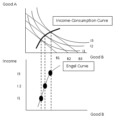
Another 'special' curve we need to be aware of is the Income-Consumption curve. This tracks the effect a change in income has on our optimum choices of the two goods. The slope of this curve tells us about the desirability of Good A and Good B as incomes rise. In general, the curve will look something like this:


There is a special case where the shape of this curve bends the other way. This is when one of the goods is an inferior good - I trust we all know what that means. A higher budget will mean less is demanded and therefore the income consumption curve will bend back on itself.

Bravo to those of you that have made it this far and hello to those that skipped straight to this section. Neither of you will be judged... honest. Finally, we are going to look at the Engel Curve. An Engel Curve shows how the demand for a good changes as income changes. We use the Income-Consumption curve and track it down onto a new diagram below.


If incomes increase and this leads to a demand increase for the good then we are looking at a normal good. If demand decreases it is an inferior good. The final, more peculiar outcome, is in the case of a giffen good. Giffen good prices rise when demand rises, odd - but they do exist.

By gosh, I think we might be finished. I said 'potentially' more in depth at the beginning - I think that word can be scrapped. If you're still unsure of anything Indifference Analysis related then drop me a comment and I'll be happy to try and help you out if I can. Thank you for reading, have a good day!
Sam.

Thursday, 4 April 2013

Is It Worth It?


I'll firstly apologise for the very philosophical/open/misleading title, what you're about to read is probably going to be a gargantuan let-down but I needed something to draw you in... and here you are - suckers. It is relevant, I promise you that.

So I've spent the past week following a very monotonous (emphasis on the word monotonous  regime of waking up, revising and then sleeping. Midway through an 'Applied Economics and IT Skills' exercise (yawn!) today I just lost all motivation; all my focus just vanished. Poof. I was sat thinking to myself "Is it worth it?" (I told you it was relevant!). Will the endless hours spent with my head buried in a textbook, drinking semi-lethal amounts of caffeine-filled drinks  actually produce a worthwhile output when results day comes around? I can feel any shreds of a social life I once had slowly disintegrating with every new note I write. I want it to all be worth it, but how do I know it will be? The only conclusion I came to is "I don't" - you can now refer back to the part where I mentioned 'gargantuan let-down' in the first paragraph and nod your head frustratingly. I'm sorry.

The fact is though, there is no way of proving that the grade you get on results day is due to the many hours/lack of revision you did in the build up. What's to say that you wouldn't have got that grade had you followed a different route during your exam preparation? I'll tell you what: nothing. The 'wonders' of revision and exam preparation are hammered into us through the many years of education without any solid evidence to prove it works. Odd.

However, we can make an educated assumption that it does no harm to revise - it just may not do any good either. That's the key point, I think. You have to bear in mind throughout the process that if the studying is sending you in any direction, then that direction is upwards. Commit 3 hours to revision or 123 hours, it doesn't matter, you can be safe in the knowledge that your grade will not be falling because of it. With that being said I implore you to keep going, your time isn't being wasted.

I guess this post is an over-ambitious attempt to motivate others, in the blind hope that it will motivate me. Surprisingly enough it has worked: Sam 1, revision 0. You can keep your motivational speaker offers for your charity event to yourself, I'm not interested - and if that isn't good enough, then I'm otherwise occupied. I can't help but pick up on the irony of the situation though - I'm talking about motivating you to revise while at the same time I'm procrastinating on another level writing this article. Funny, but we'll move swiftly away from that.

Take care, guys.
Sam

Monday, 14 January 2013

The Short-run Macroeconomic Equilibrium

A very simplified Keynesian model is used to show the short-run macroeconomic equilibrium. For example, the rate of interest is fixed to simplify the model by keeping constant money in the economy. It is also assumed that production and employment depend on the amount of spending. In that we mean that if people buy more then firms will produce more, providing that they have the spare capacity available. The basic formula we use is that the level of National Income is equal to the domestic consumption plus the three withdrawals from the circular flow of income. Or, in shortened terms: Y = Cd + W. In this model, aggregate demand is actually known as aggregate expenditure (E) and relies on the amount of domestic consumption and the injections into the circular flow of income (J). Also written as AD = E = Cd + J. We reach a point of equilibrium when withdrawals equal injections and at this same point National Income will equal aggregate expenditure. If injections were to be higher than withdrawals then National Income would rise and the withdrawals would rise until withdrawals is once again equal to injections. Now enter the 45 degree line.

The 45 degree line shows the relationship between National Income and consumption, withdrawals and injections. Consumption and withdrawals are endogenous - their value is determined by the model. However injections are exogenous, meaning their value is determined independently of the model.

At ever point on the 45 degree line (Y), the items on each axis equal each other. The C line is consumption. It differs from Cd because it doesn't contain taxes and export spending. Consumption is a function of National Income: C = f(Y). As National Income rises, so does consumption - hence the upwards slope. It crosses the 45 degree line because poorer people may be required to spending above their earnings to survive where as richer people spend less than they earn, therefore at the end of the line it is below the Y line. The slope is given by the marginal propensity to consume - the proportion of any increase in National Income that goes on consumption. It is the change in consumption divided by the change in National Income. 

Consumption is determined by a whole bunch of different things: 
  • Taxes
  • Expected future incomes
  • Expected future prices
  • Consumer confidence
  • Household wealth 
  • Attitudes of the lenders
  • Age of 'durables'
  • Distribution of income
Any changes in these cause a shift in the consumption function whereas a change in National Income causes a movement along the consumption function. 

Now onto the withdrawals. The amount saved depends on the marginal propensity to save (mps). The proportion of an increase in National Income that is saved. Mps = Change in savings / Change in N.I. Taxes is pretty much the same - it depends on the marginal propensity to tax (mpt), or changes in tax / changes in N.I. It tends to rise as National Income rises because income tax is progressive. Finally imports - depending on the marginal propensity to import. Or, mpm = change in imports / change in National Income. 

Total withdrawals will look something like this: 


Injections now and we'll start with investment. It is determined by the following things: Consumer demand, expectations, interest rate, availability of finance and cost/efficiency of capital equipment. Replacing new equipment will rely on National Income. Government spending is independent of National Income in the short term, Exports is also classed as independent on National Income to keep the model simpler.  

That's it for the background on the theory. Next we'll be moving on to how National Income is determined from all of this. Stay tuned.

Sam. 


Tuesday, 8 January 2013

The Circular Flow Of Income

*I'd like to start by wishing everyone a happy new year! I hope you all had a good time over the festive period and are getting back into the swing of things as life returns to normal. I've had a great 4 week break and am now back studying, which mean the blog will be starting again on a consistent basis until Easter!*

Today's focus will be on the circular flow of income. I'm aware this has already been discussed but like I mentioned in a previous post I do plan on going over things again in a little more depth. The best way to learn about the circular flow of income is to actually see the flow graphically:


I'll now break the flow down into it's different sections, starting with the inner flow. The inner flow consists of the factors payments going from the firm to the households and payments for goods (consumption) flowing in the opposite direction. Firms pay money to households in the form of wages, interest and rent in return for the services of these factors of production. On the other side, households pay money to firms when they consume the firms goods and services. Note we're talking only about domestic firms and domestic households here.

In a scenario where all money was spent then that would complete the flow. However, in reality, not all money is spent. This is where the concepts of injections and withdrawals from the flow come in. Withdrawals are exactly what they sound like: money being taken out of the flow. It comes in three main forms. Firstly, savings. When money is deposited in banks or other financial institutions for the future that money has been withdrawn from the flow. Taxation is another withdrawal. Income tax and national insurance comes out of a households income whereas VAT comes out of a households consumption. Receiving benefits from the government is essentially a 'negative tax'. It's a tax that is flowing in the opposite direction. Therefore the total withdrawal in the form of net taxes is total taxation minus benefit payments. The final withdrawal is import spending. This is money that has left the flow of income because it is spent on goods and services abroad.

Injections, defined as additional money flowing into the economy, also comes in three forms. Firstly: investment. Investment is money that firms spend after gaining it through financial institutions. Secondly there is government spending. This includes such things as spending on roads, hospitals, schools and the like. It does not include state benefits, that is important to note! Finally, the other injection is export spending. Money that has come from people abroad buying our domestic goods and services.

There is a slight relationship between the withdrawals and injections into the circular flow of income. For example, suppose more money is saved (withdrawal) then more money will be available for banks to lend out to firms for investment (injection). The higher taxation is (withdrawal), the more like the government are to increase spending (injection). However, we must remember that these choices are made by different people. The choice to save and the choice to invest are made by two completely different, independent parties and therefore each will have their own agenda. Due to this we can say that injections may not equal withdrawals, however they could.

The final point I'd like to discuss here is equilibrium in the circular flow if income. Like most things in economics, market forces are able to bring the circular flow to equilibrium. I'll give an example. Suppose that injections exceed withdrawals. This may be because investment has rise, but irrespective of the reason due to  this national income will rise (because of more money circulating). A higher national income means that people can consume more, but as well as this people can also save more, pay more taxes and buy more imports. Therefore withdrawals will rise, and continue to rise up to a point where it is equal to injections. This is when equilibrium has been reached and national income will remain constant until another change occurs.

Thank you for reading guys and girls. Contact me if you have any questions or feedback, have a good day/night! Sam.